New Relic · Mobile app reimagined · 5 weeks · Sole designer, team of 12
Clarity for people who can't afford confusion.
New Relic's mobile app is opened when systems are failing and time is scarce. It showed engineers everything and told them nothing. My job was less about redesigning screens than about choosing what to fix first, and defending that order.
An app people open on the worst day of their week.
New Relic is an observability platform: real-time monitoring of applications and infrastructure, fast detection of incidents and anomalies, turning enormous volumes of telemetry into something a human can act on. It supports high-availability systems where downtime is expensive.
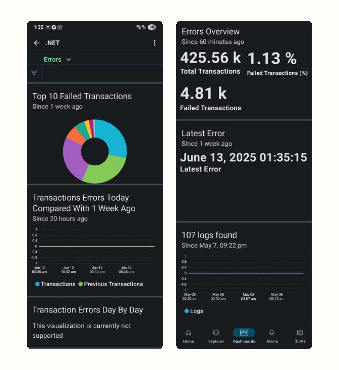
The mobile app arrived in 2013 as an extension of the web platform, and it showed. It mirrored desktop: dense, tool-centric views that prioritised data completeness and configuration over fast interpretation. That is a defensible choice on a large monitor. It is the wrong one on a phone held by an on-call engineer at 3am.
The gap was never access. It was interpretation.
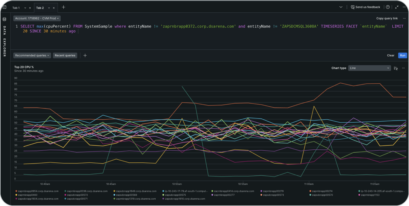
- The user problemPeople could reach the data on mobile but not understand it quickly. Dashboards were dense and signals unclear, forcing analysis at the exact moment someone needed direction.
- WhoOn-call engineers and operational leaders checking system health on a phone, in time-critical moments.
- Business contextMobile is a trust and retention touchpoint. Faster understanding of system health feeds directly into reliability and customer confidence.
- ConstraintsSmall screens, limited attention, high data complexity, evolving requirements, and a distributed engineering team.
Core challenge: how might we turn complex operational data into clear, decision-ready insights on mobile, for high-pressure situations?
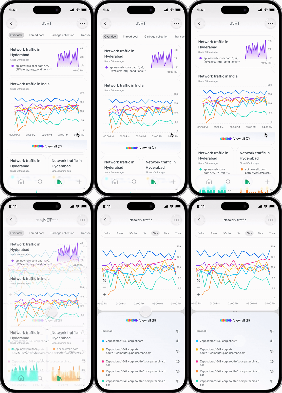
"Each line is one service. There are twenty of them, and the phone is five inches wide."
I argued for redesigning less.
The obvious brief was to reimagine the mobile app. With five weeks and one designer, attempting that would have produced a broad, shallow refresh that engineering could not ship. So I scoped it down to a single surface and defended the choice.
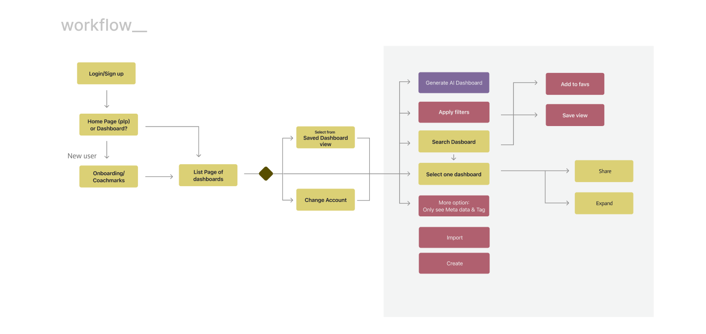
Start with dashboards. Ship a view-only mobile app first.
- Most-used feature. Dashboards were where people already went.
- Highest decision weight. They carried the calls that mattered.
- Immediate value. Improving them paid off without waiting on the rest.
- Alerts already worked. Not beautiful, but functional. Leave them.
The second call was about order. There was appetite to lead with intelligence and automation. I argued for data visualisation first, and for three reasons that were about the team as much as the product.
- Unblock engineeringA visualisation system is buildable immediately. Intelligence features would have stalled on modelling questions nobody could answer in week one.
- Establish trust in the dataNobody believes an AI summary of numbers they cannot yet read themselves. Legibility has to come before inference.
- Align on what good looks likeGetting stakeholders to agree on a clear insight is far easier with a chart on the table than with a roadmap slide.
Design by subtraction, not decoration.
The visualisation system was mobile-first rather than mobile-adapted. Every rule below exists to answer one question faster: what is wrong right now?
- Hierarchy for riskAnomalies and risk states read first. Everything else recedes.
- Consistent chart patternsThe same shape means the same thing everywhere, so the reading is predictable under stress.
- Touch-friendly spacingTargets and gaps sized for a thumb, not a cursor.
- Simplified legends and labelsThe single densest failure point on a small screen, treated as a first-class problem.
Once visibility was solved, I added Share as a core action rather than an afterthought: share a dashboard instantly mid-incident, support async collaboration, and cut the overhead of explaining what you are looking at. Sharing turned dashboards from a viewing surface into a communication tool.
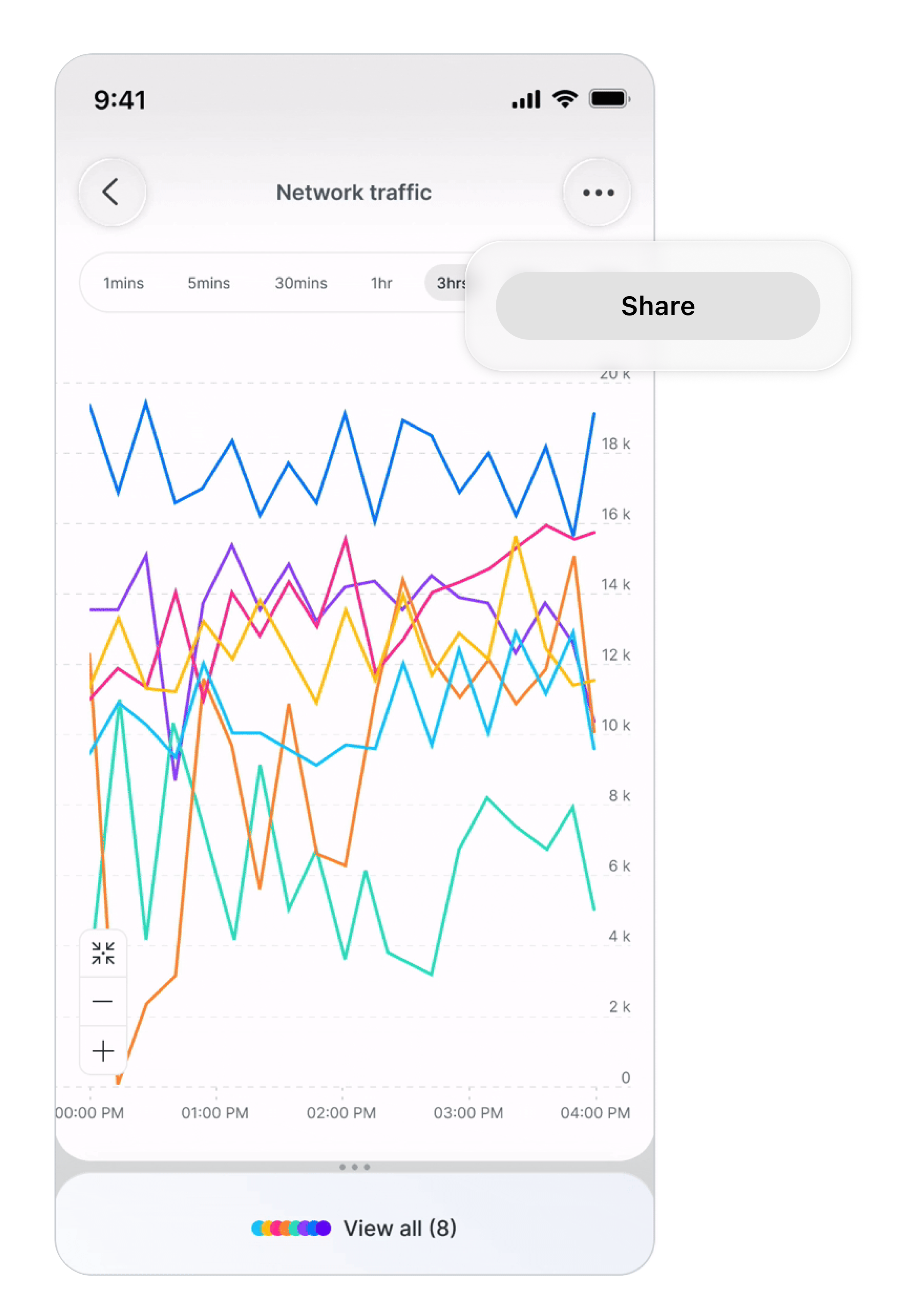
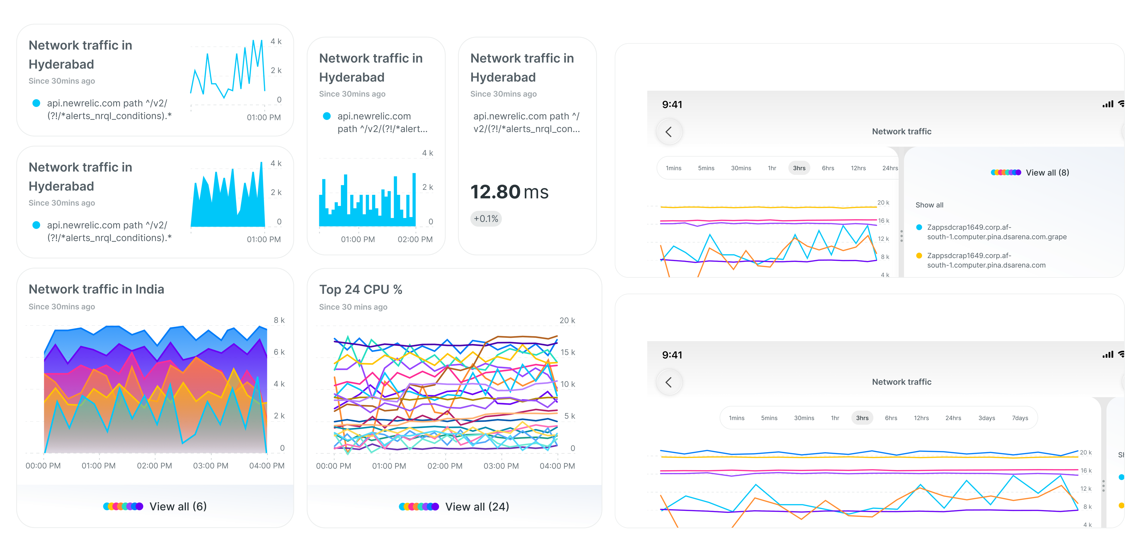
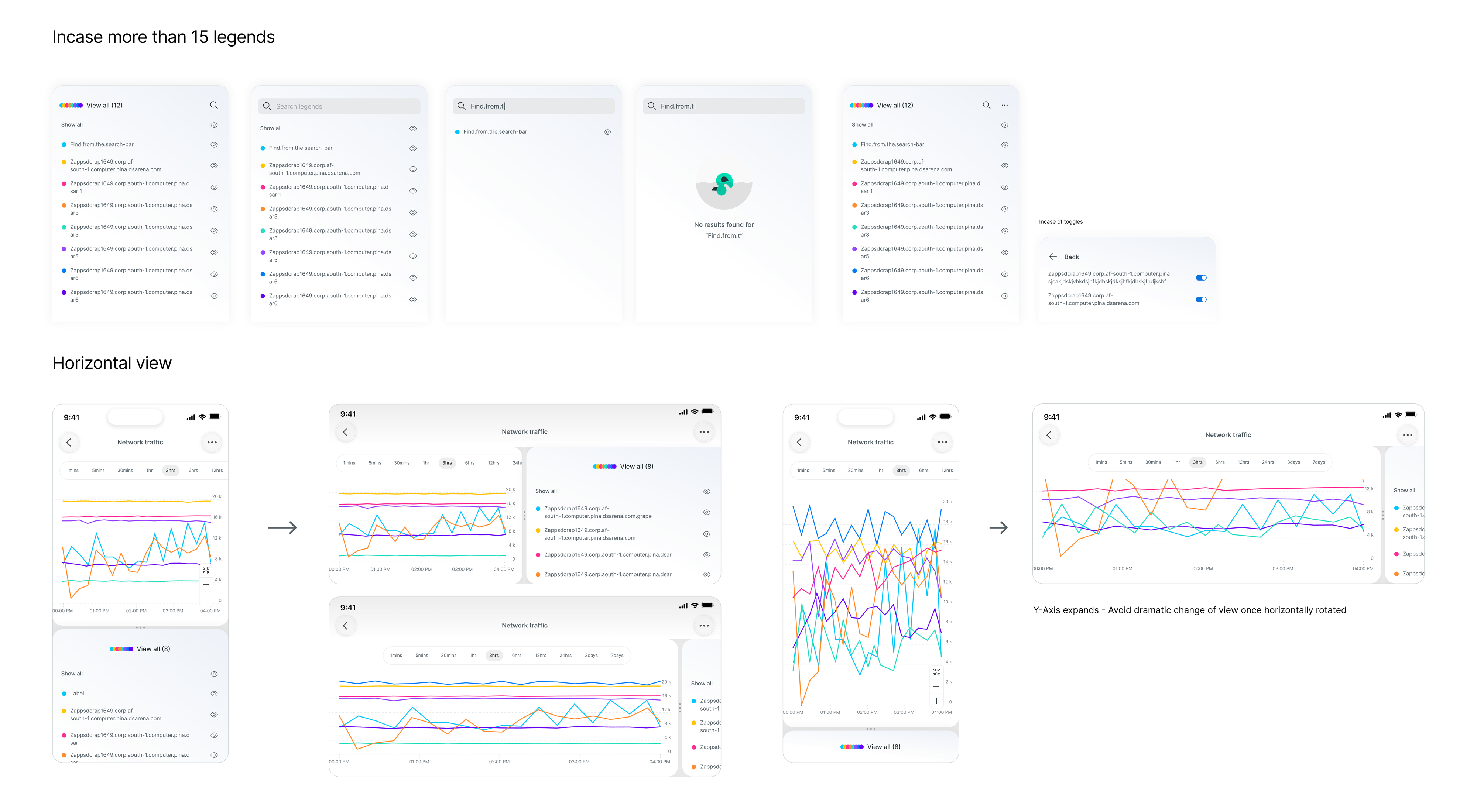
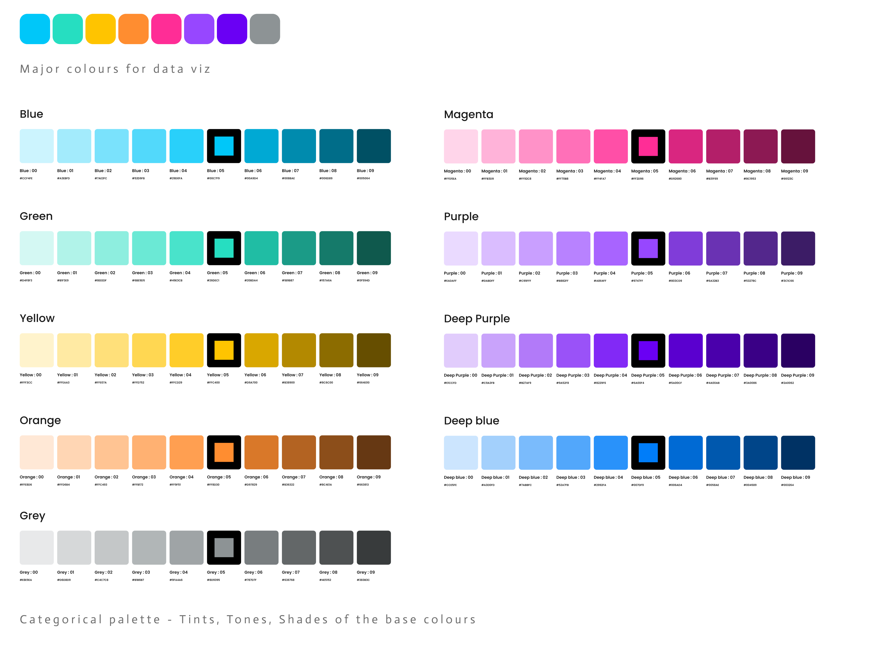
The visualisation rules, and Share promoted to a core action.
1 / 4The legend work is the part I would point an interviewer at. Twenty overlapping series is normal for this product, and a legend list is where a mobile chart usually collapses. Search within legends, per-series toggles, an empty state, and a rotation rule that expands the Y axis instead of re-scaling the whole view, so the picture does not lurch when someone turns the phone.
Only then, AI as a decision partner.
With the data legible and trusted, intelligence had something to stand on. AI was used to anticipate issues, summarise system health and guide resolution, turning dashboards into decision helpers that reduce response time and lower operational effort.
The resolution flow keeps the human in the loop by design: some fixes auto-resolve, some require explicit approval, and genuinely complex issues hand off to manual guidance with steps rather than pretending to be confident.
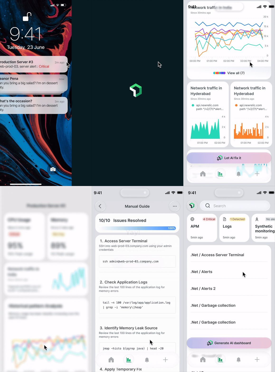
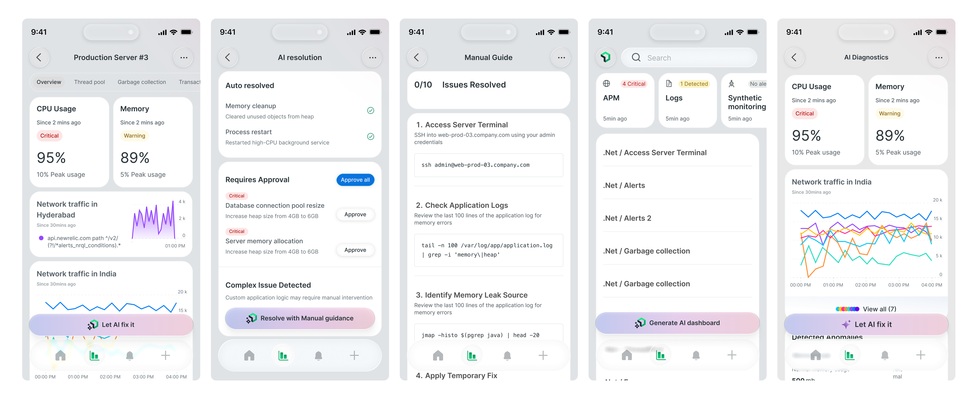
The whole path: critical alert on the lock screen, straight to the server, then Let AI fix it.
1 / 2The argument I lost, and what I did about it.
Hybrid vs native reality
What I proposed: a hybrid approach, to unify the design across platforms and speed up iteration.
What happened: the organisation was deeply invested in native iOS and Android. Switching would have disrupted established workflows and delivery.
What I did instead: designed a shared visualisation system that works across both native platforms, holding consistency where it mattered and conceding the implementation model.
Judgment without precedent
The problem: requirements evolved mid-project and there were no established consumption patterns to lean on for this kind of data on mobile.
The call: define hierarchy and meaning myself, then hold those definitions steady so a distributed team of twelve could build against something stable.
Why it mattered: with one designer and twelve engineers, ambiguity is expensive. Deciding quickly and documenting clearly was worth more than deciding perfectly.
Strong UX leadership means delivering impact within real constraints, not forcing ideal solutions.
Mobile went from tolerated to trusted.
Dashboard views became the primary entry point for 60 to 70% of mobile sessions, a direct signal that engineers were willing to rely on the phone during high-pressure moments rather than waiting to reach a laptop. The new graph patterns drew 2× the interaction of the legacy views, measured across tap, expand and share.
The share metric matters more than it looks. It means dashboards were being used to communicate during incidents, which is the behaviour the redesign was aiming at.
The honest ledger.
What worked
- Scoping down. One surface done properly beat four done partially, and it gave engineering something shippable in week one.
- Sequencing visualisation before intelligence. It built the trust that later AI features needed to be believed.
- Designing the edge cases. Legends and rotation are where mobile charts usually fail, so they got first-class attention.
What I would do differently
- I have no before-and-after task timings. Adoption and interaction went up, but I never instrumented time-to-diagnose, which is the number that would have proved the actual claim.
- Accessibility of the palette went unverified. A categorical palette this size needs colour-blind testing, and five weeks did not include it.
- View-only was the right start, not the end. The scoping call needed a written follow-on plan so it read as sequencing rather than omission.
What I'd measure next
- Time from alert to diagnosis on mobile
- Share actions per incident
- Rotation and legend-search usage
- Sessions ending without escalating to desktop
- AI suggestion approval versus override rate