New Relic · Change Tracking · 2024 to 2025 · Shipped with GitHub Copilot
When the AI says roll back.
Designing New Relic's AI Change Intelligence Report: an automated verdict on whether a deployment broke production, delivered inside New Relic and inside GitHub Copilot. The hard part was never the answer. It was making an engineer able to check the answer at 2am.
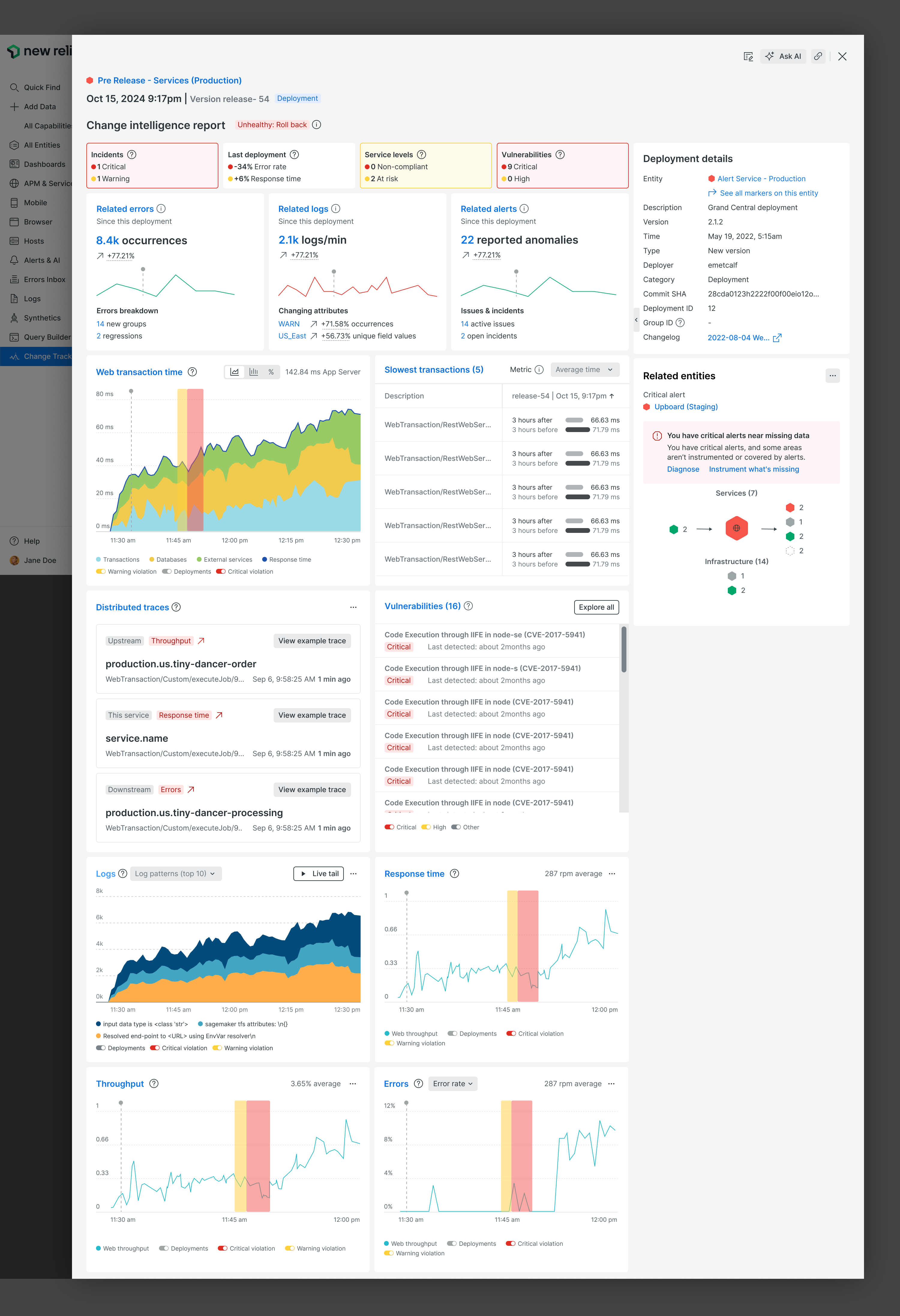
Every deploy ends with the same unanswered question.
A team ships a change. Minutes later someone asks: did that break anything? Answering it honestly means checking error rates, response times, logs, traces, alerts, service levels and vulnerabilities, then deciding whether what you're seeing is the deployment's fault or noise. That work happens under time pressure, often by whoever is on call rather than whoever wrote the code.
New Relic already had all the data. What it didn't have was a verdict. The Change Intelligence Report was the answer to that: New Relic AI reads the change's impact across every signal and says what it thinks you should do next.
"The data was never the problem. The judgment was."
Two problems, one for each audience.
UX: for developers and their managers, it is difficult to identify the expected outcomes, the issues, and to fix them in their deployments.
Business: make New Relic a must-have for GitHub users.
The business goal mattered more than it looks. It meant the report could not live only inside New Relic: it had to be useful to a developer who never opens New Relic at all. That single constraint shaped everything downstream, from the two entry points to the fact that the whole report has a plain-language version.
Padma didn't ship it, but she owns the next ten minutes.
The whole design was written against one story, deliberately chosen so the person judging the change is not the person who made it.
- A coworker deploysPadma's teammate initiates a deployment. She wasn't involved.
- She asks CopilotShe asks GitHub Copilot how the deployment is performing, without leaving her editor.
- Copilot answers with a reportCopilot checks with New Relic AI and returns a change deployment report.
- She acts with guidanceShe takes action on the deployment with a clear recommendation and the evidence behind it.
Meet the developer where they already are.
Two ways in, designed for two different people. An SRE living in New Relic picks a change event from Change Tracking and generates the report. A developer living in their editor asks Copilot, and lands on a report that is already generated.
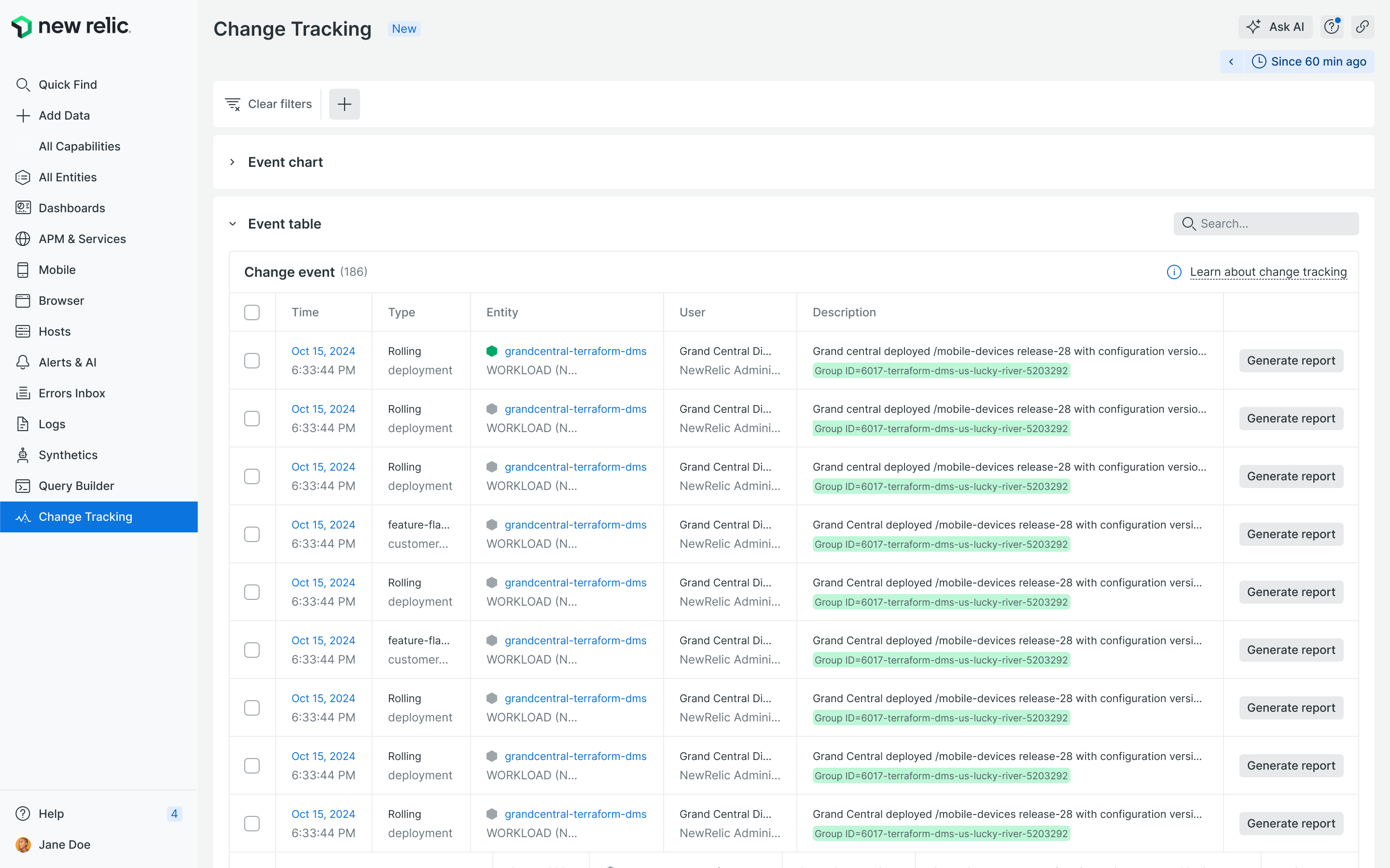
Entry point 1: Change Tracking. Every change event, with Generate report one click away on each row.
1 / 1Entry point 2 is the interesting one. The same verdict, rewritten for a chat window. No charts, no dashboard: a checklist of what was examined, a plain-language conclusion, and a link back to the evidence for every single claim.
✅ Vulnerabilities: No new vulnerabilities (go to Vulnerability Management)
✅ Logs: No errors, warnings, and other log issues (go to logs)
✅ Traces: All endpoints operating within the expected response time (go to traces)
✅ Golden signals: No anomalous latency, traffic, errors, or saturation (go to New Relic)
If you want to see information for each golden signal, run this query in New Relic: QUERY
✅ Alerts: No alerts exceed the thresholds you set (go to alerts)
✅ Errors: No new errors turned up (go to errors inbox)
Overall status: Looks healthy! 🤩
✅ Everything checked out. 'demo-kafka-service (staging.stg-creepy-beep)' is good to go.
Scroll up to see the areas we checked or follow the links back to New Relic for a deeper dive.
Every line names what was checked, not just what was concluded. "Looks healthy" is the last thing it says, not the first, and it is followed by an invitation to go verify. That ordering was deliberate.
One verdict, three states, and evidence that never moves.
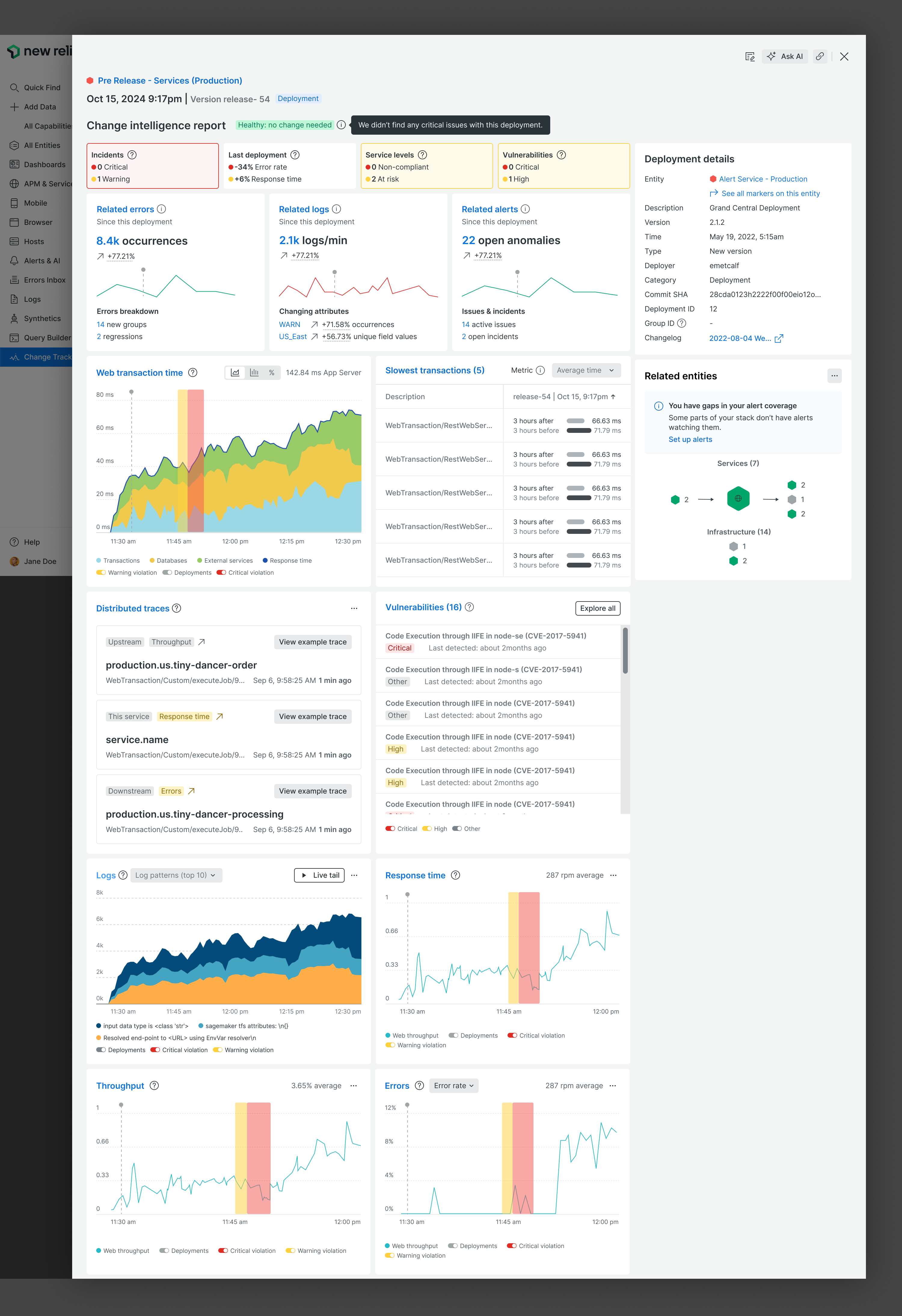
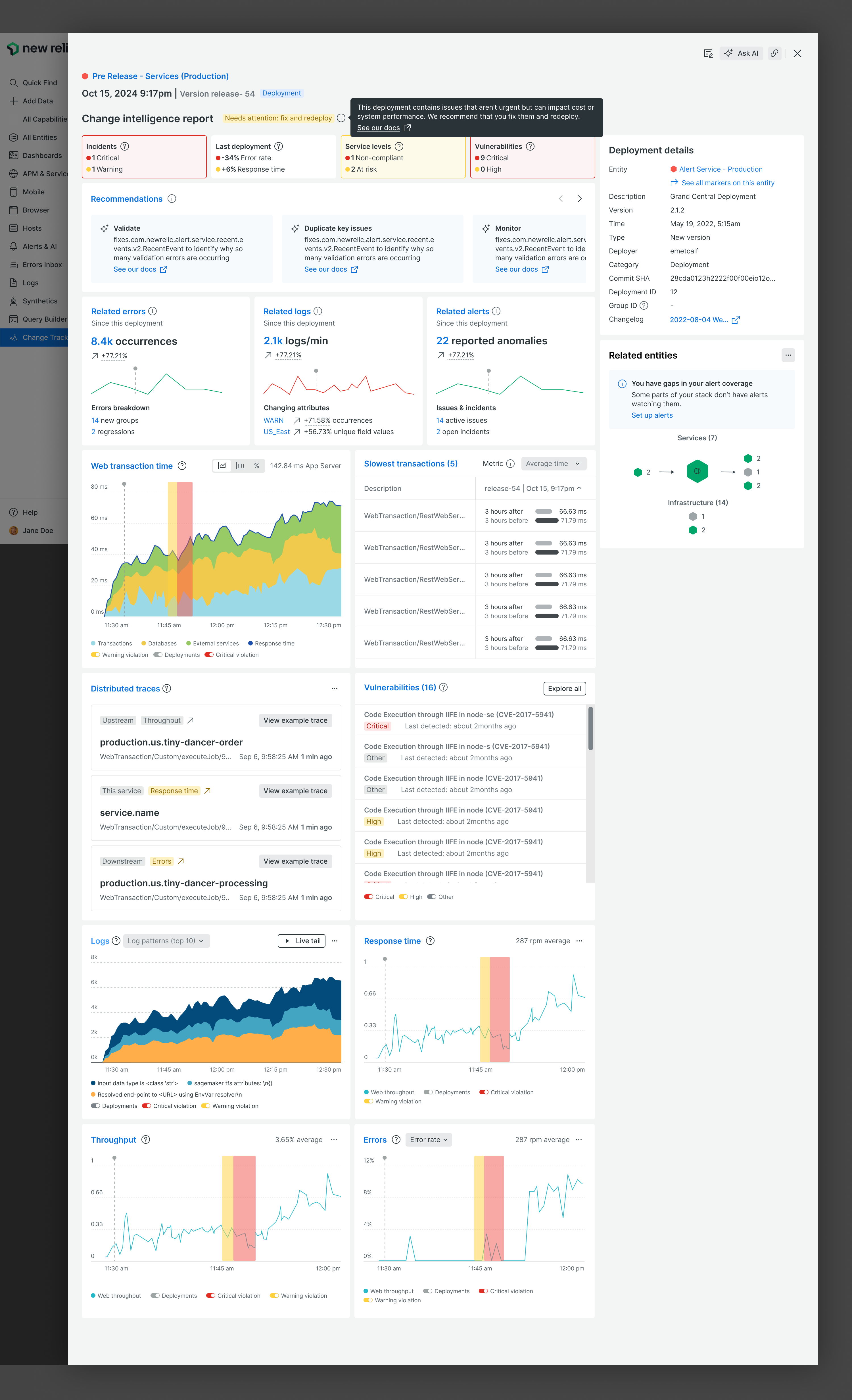
The report opens with a single status next to the title. That status is the entire AI opinion, and it only ever takes one of three values.
Healthy
No critical issues found. Nothing to do.
"We didn't find any critical issues with this deployment."Good, fixing required
Safe to stay deployed, but something needs attention before it becomes a problem.
"Good but fixing required."Unhealthy
The change is causing harm. Roll back.
"Unhealthy: roll back."The layout underneath is identical in all three cases. Same tiles, same charts, same panels, same order. This was the most consequential decision in the project and the least visible one.
A verdict-shaped interface would have been tempting: hide the charts when everything is fine, surface only the failing signal when it isn't. I argued against it. If the evidence rearranges itself around the conclusion, an engineer can never learn the report, and can never tell the difference between "this signal is fine" and "this signal was hidden from me". A stable surface is what makes the verdict auditable rather than authoritative.
Unhealthy: roll back. The verdict is red, and the deployment marker on every chart shows exactly where things turned.
1 / 3Four things that let you disagree with it.
An AI verdict on a deployment is a claim that can be wrong at the worst possible moment. These are the mechanics that make disagreement cheap.
- Deltas, not valuesEvery headline number is expressed as change since this deployment: 8.4k error occurrences, up 77%. An absolute number tells you nothing about whether the change caused it.
- Before and after, side by sideThe slowest transactions list shows 3 hours before against 3 hours after, per transaction. You can see the regression rather than take the verdict's word for it.
- The deployment markerEvery chart carries the same vertical marker at the moment of deploy. If the line was already climbing before the marker, the deployment is not your culprit.
- Provenance panelCommit SHA, deployer, version, changelog and deployment ID sit permanently on the right. The verdict is about a specific change by a specific person, and you can go read it.
Suggestions you can throw away.
Beyond the verdict, the report proposes next steps. Each one is categorised by what kind of action it is, carries a concrete task rather than an observation, and can be dismissed outright.
The dismiss control did real work in review. A recommendation you cannot dismiss is an instruction, and the moment the system starts issuing instructions it owns an outcome it cannot actually be accountable for. Dismissal keeps the human in the decision.

What this design gives up.
Stable layout vs faster answers
The cost: because the report never reorders itself around the verdict, a healthy deployment still renders a full page of charts nobody needs to read.
Why I kept it: the alternative teaches engineers that the interface hides things, which is fatal for a tool whose only job is to be believed.
Where I'd push next: keep the layout fixed but let the verdict scroll you to the signal it used, so the fast path exists without the surface becoming conditional.
A verdict vs a confidence score
The cost: three discrete states hide how sure the system actually is. "Unhealthy" reads the same whether the evidence is overwhelming or marginal.
Why I kept it: a percentage invites bargaining at exactly the wrong moment, and in testing nobody could say what 70% confident should make them do.
Where I'd push next: express confidence through the evidence, by ranking which signals drove the verdict, rather than through a number on the conclusion.
The honest ledger.
What worked
- Verdict first, evidence permanent. The single most useful decision. It let the report be skimmed in two seconds and audited in two minutes.
- Two surfaces, one answer. The Copilot version forced the whole report to have a plain-language form, which made the New Relic version clearer too.
- Dismissible recommendations. Kept the system advisory instead of directive.
What I would do differently
- I designed the happy path first. The healthy and unhealthy states came before the ambiguous one, and "good but fixing required" was the hardest and least resolved of the three.
- No wrong-answer state. There is no designed moment for "the AI got this wrong", and no way for an engineer to tell it so. That feedback loop is the biggest gap.
- Recommendations are generic. They advise on the service, not on the specific change, which is a missed opportunity given the report knows exactly what changed.
What I'd measure next
- Verdict agreement rate: how often engineers act as advised
- Time from deploy to decision
- Rollbacks that turned out to be unnecessary
- Recommendation dismissal rate by category
- Copilot-initiated reports vs native