PharmEasy · Diagnostics · 5 weeks · Consumer health
After the report, silence.
85% of users opened their lab report. Then the product said nothing for up to six months. Health Trends was the answer: turning one-off diagnostics into a continuous health journey, for 50 million users who mostly book a test when they are already worried.
Diagnostics is a repeat-use category that nobody repeated.
PharmEasy is a health tech platform built to remove friction from healthcare access: medicines, diagnostic tests and home sample collection in one place. It operates where trust, clarity and speed are critical, and every design decision reaches millions of people.
In 2021 the company moved into diagnostics through the Thyrocare acquisition, unlocking a high-frequency, repeat-use category. By early 2022 the goal shifted from acquisition to sustained engagement across the journey, from booking through report consumption. It wasn't working. Traffic grew, but engagement collapsed after checkout, and the experience had no continuity once a report arrived: low repeat usage, heavy support dependency, reduced trust in the whole diagnostics flow.
The opportunity: reimagine the diagnostics experience to drive post-booking engagement by reducing uncertainty, increasing transparency, and building trust across sample collection, status tracking and report delivery.
The numbers said episodic. The interviews said why.
What the data showed
- 85%+ view their reports, then engagement drops sharply, in a category built on repeat use
- 30 to 180 days between report delivery and the next booking: a prolonged silence with no meaningful touch points
- 4,000+ daily lab bookings against 3.9M transacting users: usage is episodic, not habitual
- ~65% re-engage within 24 hours of a report, so intent is strongest immediately, and the product offered nothing to act on
What users said
- They don't know what comes next. After viewing a report, many were unsure how to interpret results or what to do, so they disengaged rather than follow up
- It feels transactional. Lab tests were treated as one-off events, with no reason to return unless a doctor said so
- Professionals become the fallback. In moments of confusion users relied on people, not the product
- Trust comes from transparency, not volume. Simple human explanations, phlebotomist details, timelines and progress beat more medical data
Method: quantitative funnel and time-to-re-engage analysis, plus 1:1 remote interviews structured around four themes: report delivery and understanding, post-report engagement, trust and retention, and a wrap-up on the most frustrating part of the experience. Small qualitative sample, so every interview claim was checked against the behavioural data before it shaped a decision.
"Intent peaked in the first 24 hours after a report. The product had nothing to offer in that window."
Three people, one unmet need.
Proactive health tracker watches
- Who
- Health-conscious users tracking wellness proactively.
- Needs
- Easy-to-read trends, reminders for the next test, insights they can share with a doctor or family.
- Pain
- Reports are hard to interpret, there is no consolidated long-term view, and retest timelines get forgotten.
Chronic care monitor manages
- Who
- Living with thyroid, diabetes, cholesterol, PCOD or PCOS.
- Needs
- Tracking that isn't manual, and re-tests that don't get missed.
- Pain
- Manual tracking is confusing, a missed re-test means delayed intervention, and reports are scattered across labs and apps.
Family caregiver coordinates
- Who
- An adult booking on behalf of parents, spouse or child.
- Needs
- Switch patient profiles easily, get notified for elderly and child re-tests, trust the dashboard at a glance.
- Pain
- Juggling multiple records, forgetting family test cycles, and re-explaining reports to the people they care for.
The caregiver persona is the one that changed the architecture. Designing for someone managing three people's health, not their own, is what forced patient switching to be a first-class control rather than a setting.
Everyone stored the reports. Nobody explained them.
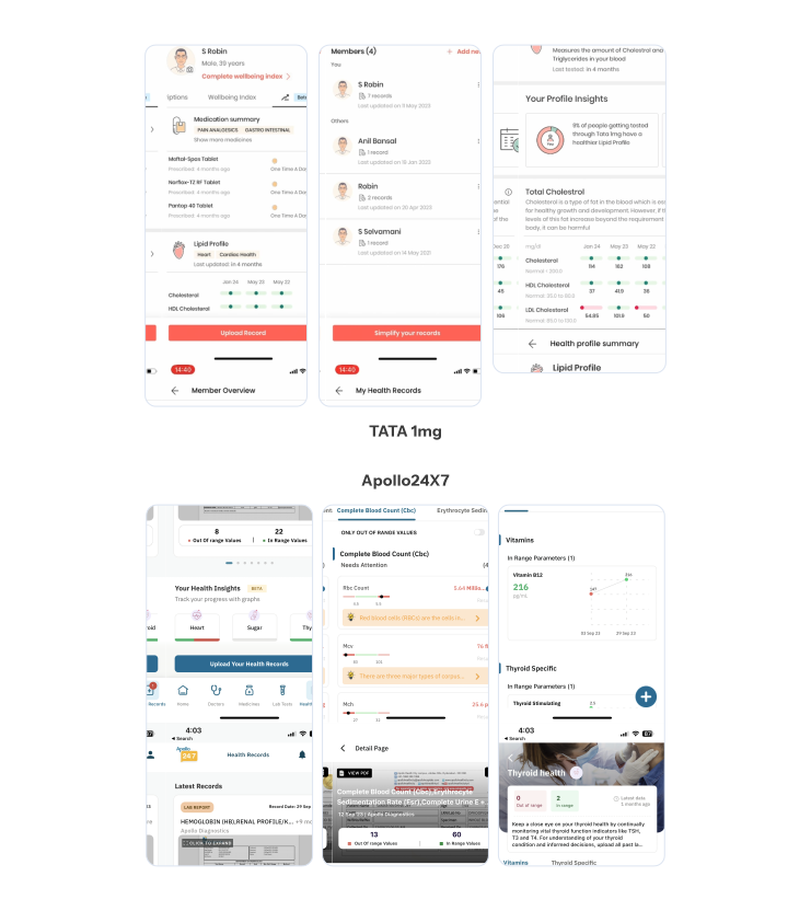
Competitors had strong data systems and secure report vaults. Trends existed conceptually, but were not surface-level, visual or user-friendly. The category was competing on record access, not on continuous health understanding or action, which is exactly where the opportunity was.
Three things that made this harder than a dashboard.
- Designing for anxious usersMost people book a lab test when they are already stressed or unsure. Clarity and reassurance mattered more than feature depth.
- Making reports legibleUsers received real medical reports but could not tell what had changed over time, or what to do about it.
- Sustaining engagement after the reportOnce a report was viewed there was no reason to return unless something external prompted it.
How might we help users understand their diagnostic results over time, spot meaningful changes early, and feel supported between tests, so diagnostics becomes a continuous health journey that drives repeat engagement and retention, while operating within clinical accuracy, regulatory compliance and operational constraints?
Trends first, not medical classifications.
I explored two structures for the same content. Both ended in the same place, guided next steps and continued engagement. They differed entirely in what a user meets first.
- Option 1 · chosenLevel 1: Health Trends and Reports. Level 2: parameter categories like lungs and liver.
- Option 2Level 1: In Range, Out of Range, Not Tested. Level 2: the same parameter categories.
I chose Option 1. It starts with health trends rather than medical classifications, so users explore progressively instead of being sorted into clinical buckets on arrival. It reduces cognitive load, and it scales as more reports, parameters and insights are added over time.
Option 2 was tempting because it front-loads the answer: two parameters need attention, here they are. But for an anxious user, opening a health feature to a red "Out of Range" tab is an alarm, not an orientation. And structurally it ages badly: the tab a user lands on changes every time their results change.
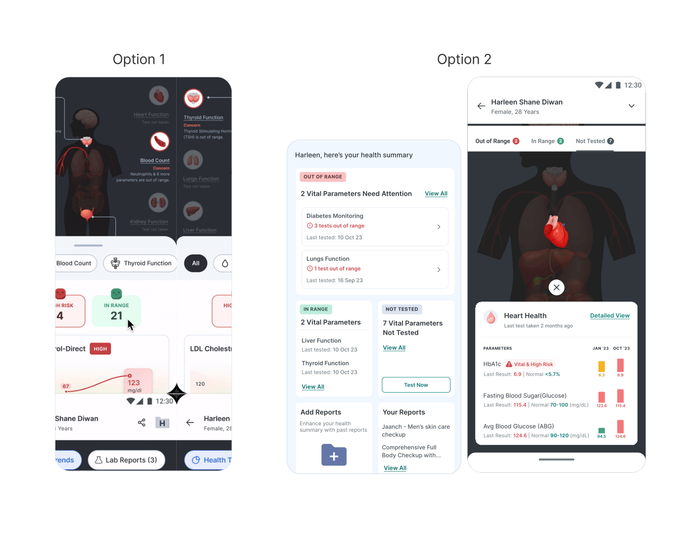
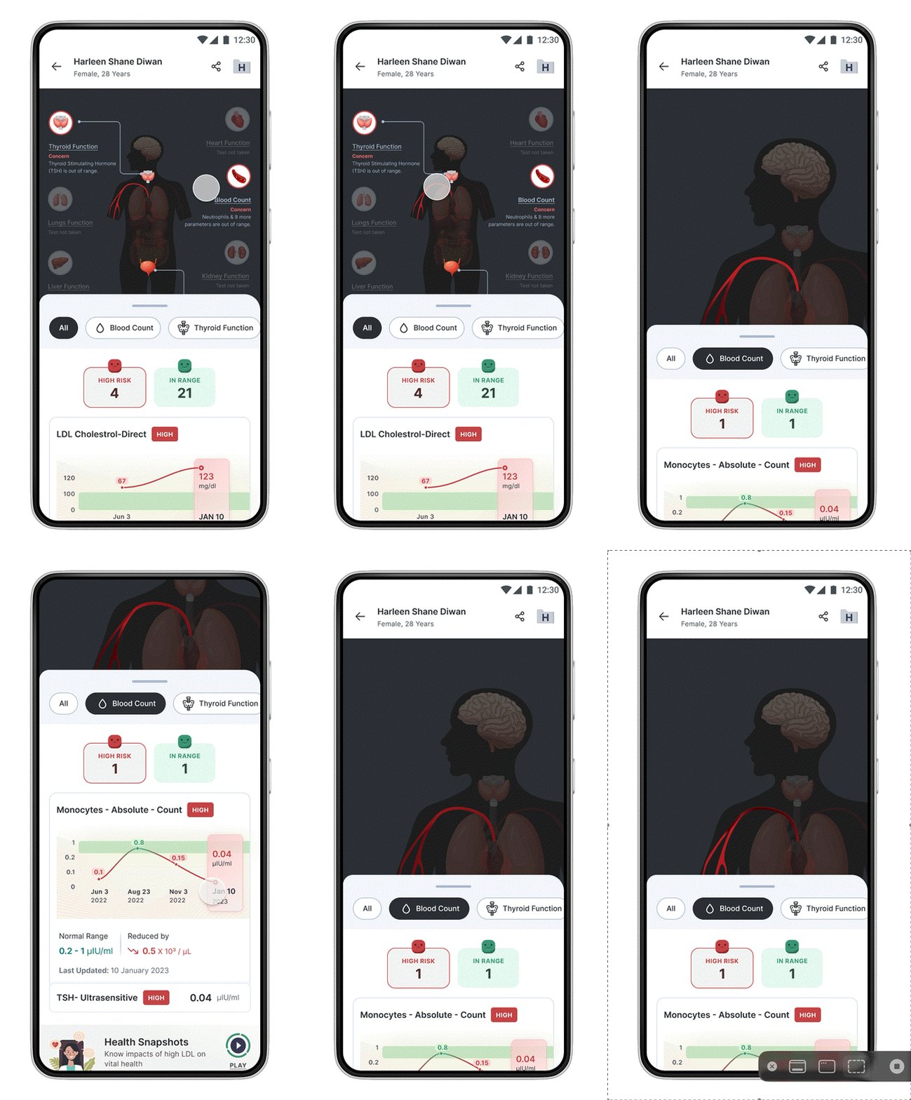
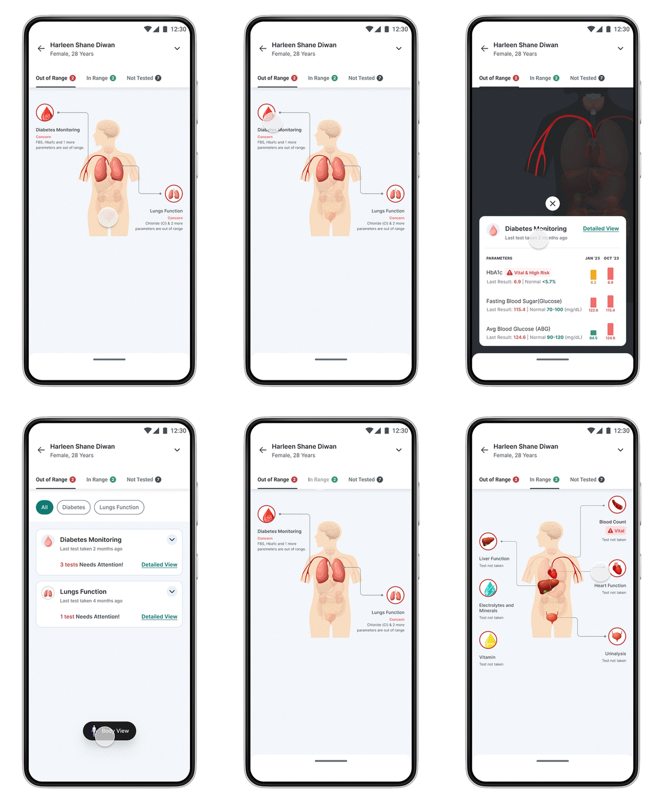
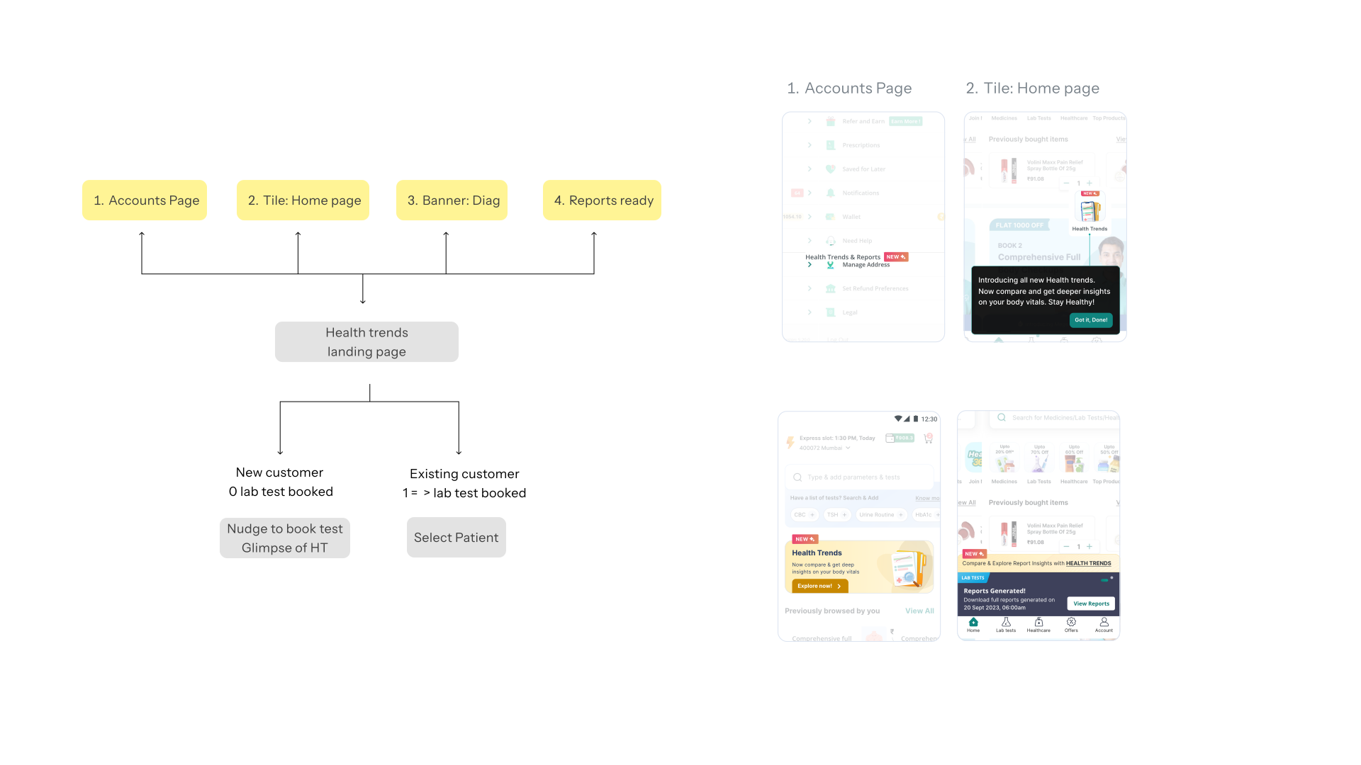
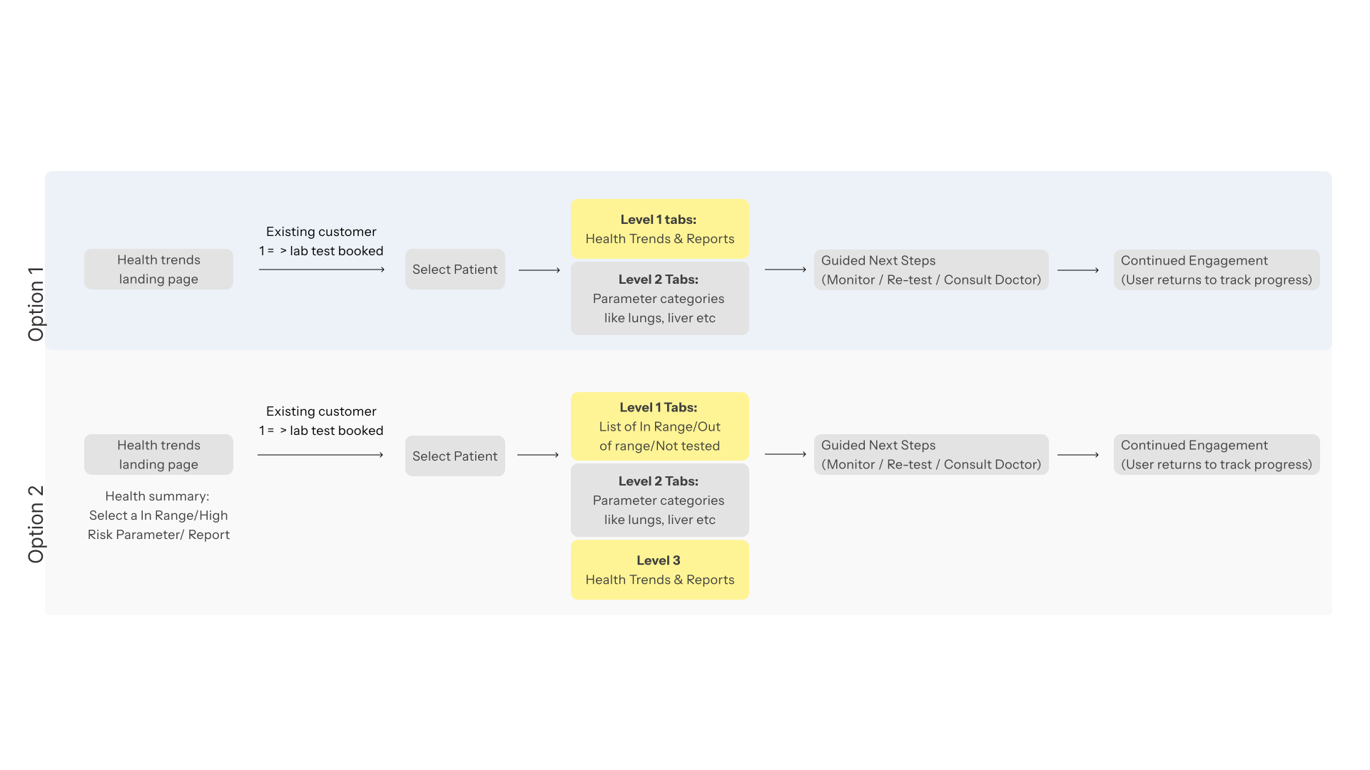
The two options, side by side. Option 1 opens on trends; Option 2 opens on clinical status.
1 / 5One widget, doing most of the work.
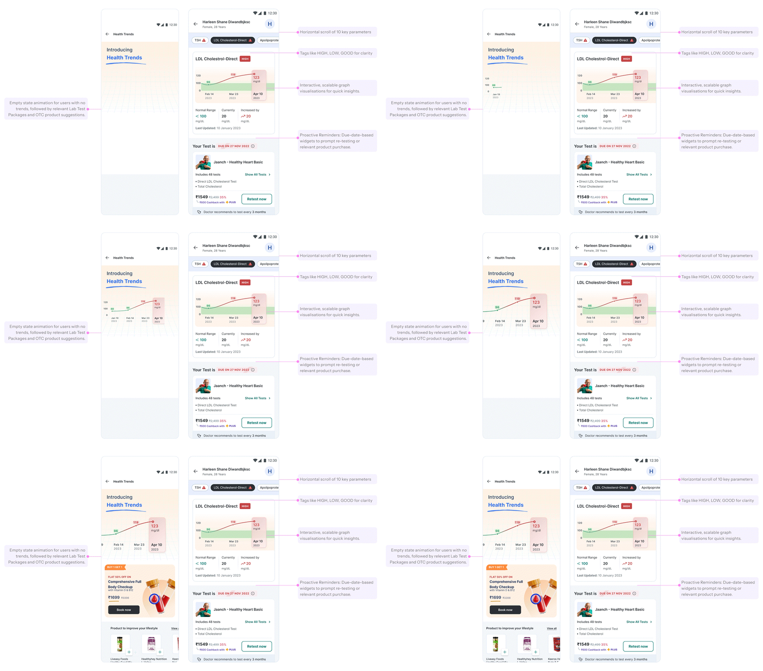
The parameter card is the atom of the whole feature. It had to carry a value, its direction, its safe range, its recency and its urgency, without ever reading as an alarm to someone who is already worried.
- Status without alarmColour signals urgency through a HIGH, LOW or GOOD tag rather than shouting. The palette carries meaning; the tone stays calm.
- The delta, not just the valueMost recent reading plus how much it moved since the last test. A number alone tells you nothing about direction.
- The healthy range, drawnA shaded band behind the line, so where you stand relative to normal is visual rather than something to calculate.
- Recency, statedLast-updated date on every card, which quietly reinforces when it is time to test again.
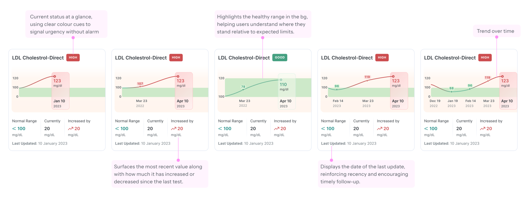
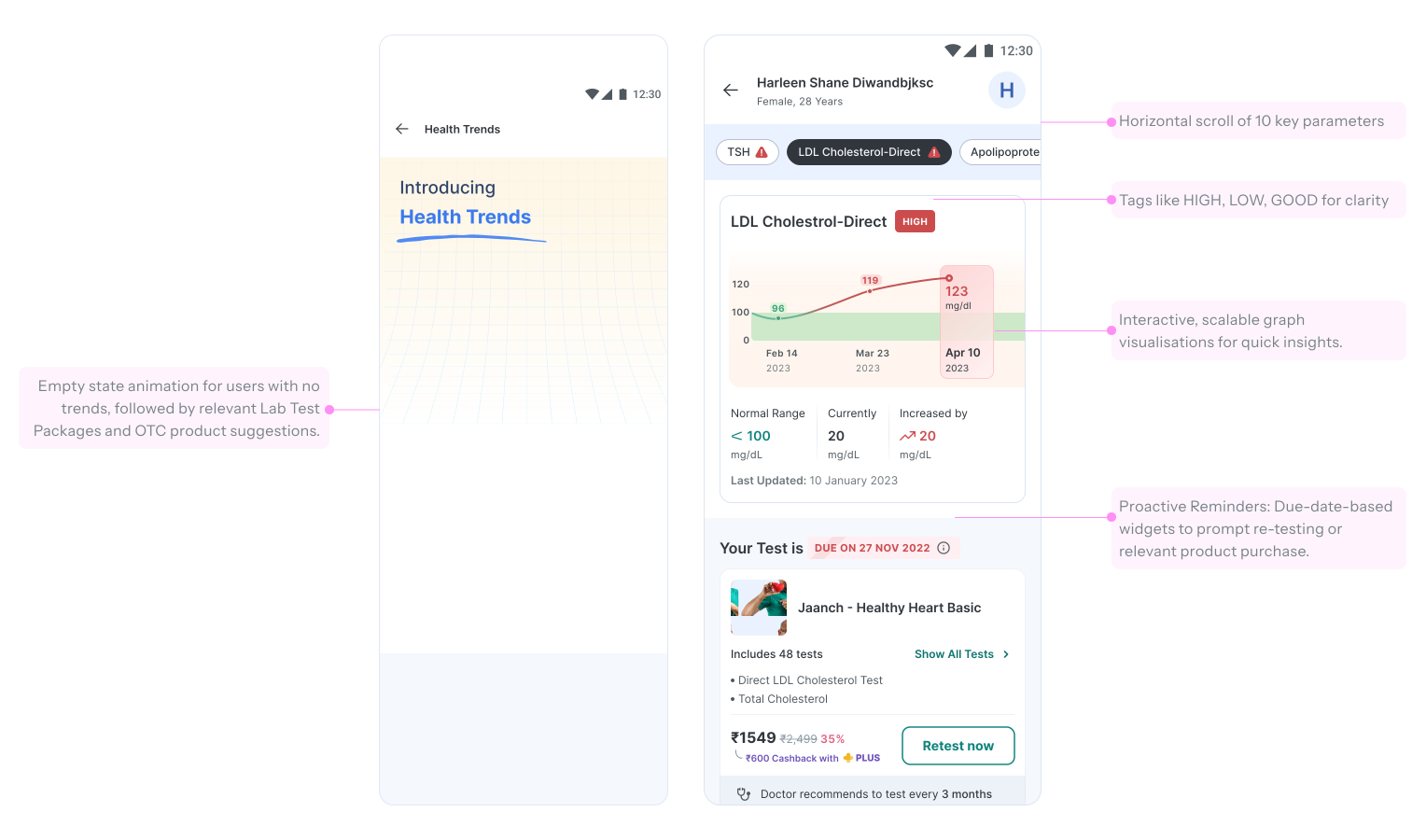
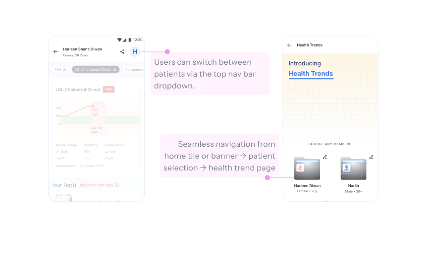
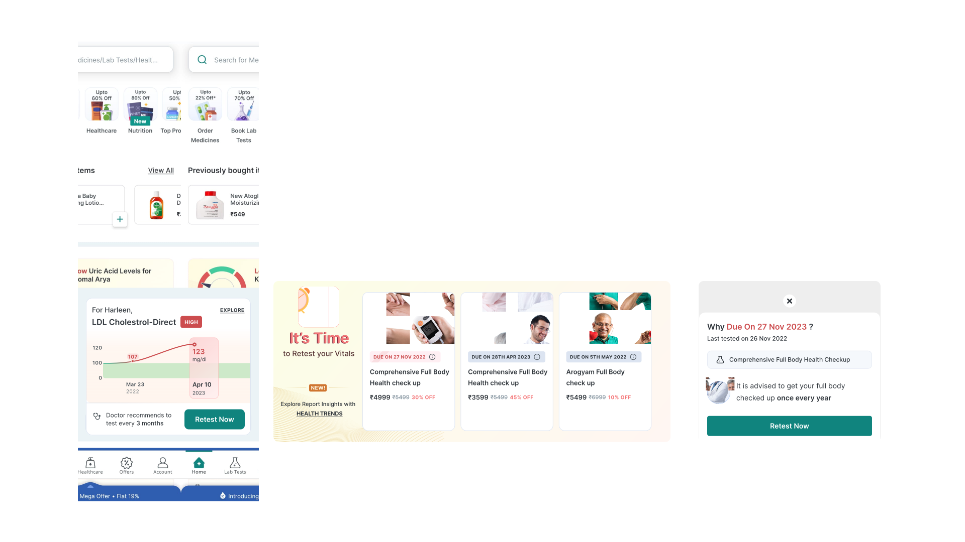
Five states of one reusable widget: status, delta, healthy range, recency, and trend over time.
1 / 4Testing told me the name was wrong.
Moderated usability testing with 10 users aged 18 to 44 of mixed tech proficiency, deliberately including chronic patients, caregivers and recent lab-test users. We tested live and prototype flows across discovery, understanding trends and re-testing, under three scenarios: a recent report available, a retest due, and no historical trends at all.
The point was to check it worked for first-time and repeat diagnostic customers alike. We measured discoverability, onboarding clarity, navigation patterns and graph readability.
Discoverability. Users couldn't locate the feature, and found the term "Health Trends" too generic. so renamed it to Health Status and added a Home-screen entry point.
Onboarding confusion. Every participant mistook the onboarding animation for their own real health data. so added an explicit "Tutorial Preview" label to set expectations.
Navigation. The horizontal parameter chips were not discoverable. so introduced a coach mark to make the interaction visible.
Graphs and trends. Users found the graphs easy to read, but wanted to inspect them more closely. so logged zoom interaction as a scoped future enhancement rather than rushing it.
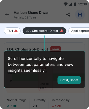
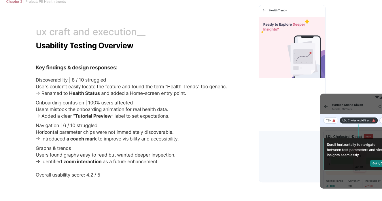
The coach mark: the fix for the 6 in 10 who never found the horizontal parameter chips.
1 / 2The naming failure is the one I'd highlight. "Health Trends" was my own title, on the brief, in every review, in the file name. Eight out of ten people couldn't find it. Testing was the only reason it changed before launch instead of after.
The honest ledger.
What worked
- Data first, then interviews. The 30 to 180 day gap gave the problem its shape; the interviews explained the cause. Neither would have been enough alone.
- Choosing orientation over the answer. Leading with trends rather than clinical buckets kept the feature calm for anxious users and durable as data grows.
- One reusable widget. Designing the parameter card properly meant Home, Health Status and reminders all inherited the same logic.
What I would do differently
- Four interviews is thin. The qualitative sample was small for a feature reaching millions. I leaned on quantitative data to compensate, but I would push for a larger sample now.
- I tested the name too late. A five-minute card sort in week one would have caught the discoverability problem before it reached prototype.
- The empty state was an afterthought. Users with no test history are exactly the ones who need convincing, and that path got designed last.
What I'd measure next
- Time to re-engage after report delivery
- Repeat booking rate within 180 days
- Retest reminder to booking conversion
- Support contacts about report interpretation
- Caregiver profile-switching usage