Inception, InAlpha · Design system for AI generation · Light and ADCB
A picture of the rules is not the rules.
Our design system lived in three Figma files. Designers could use it and nothing else could, so every version of every feature was built by hand, and once the product went white label, built twice. I rewrote it into something agents can build from. Now a screen is generated in both brands from one request, and the team's time goes on choosing between versions and polishing the one that wins.
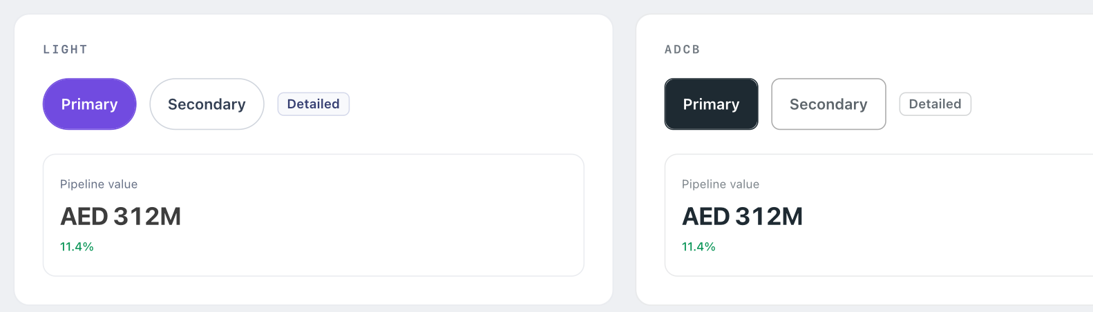
Every version, by hand, twice.
A feature never arrives as one screen. It arrives as four or five versions someone has to see before choosing, and then the chosen one gets polished. My team built each of those by hand.
Then Inception went white label. It ships to ADCB's credit committee as Credit Companion, so every one of those versions now existed twice, once per brand, on every release.
I was the bottleneck, and hiring would not have fixed it. The work was not hard. It was endless, and it was the wrong work to spend designers on.
"Re-skin it" sounds like a colour swap.
I handed a screen to an AI tool to see how far it got. It came back close and wrong: colours near enough to pass, a corner radius it invented, a font it chose for itself. It was not being careless. Our system is a set of pictures. A designer looks at a button and knows it is a pill because a token says so. Software sees a shape that happens to be round.
So before building anything I stopped reading the Figma file and started measuring it. I pulled the resolved value of every bound token off the ADCB frames and compared it with ours, one by one.
Three of the tokens that changed were not colours at all. They changed shape.
What the second brand actually changed
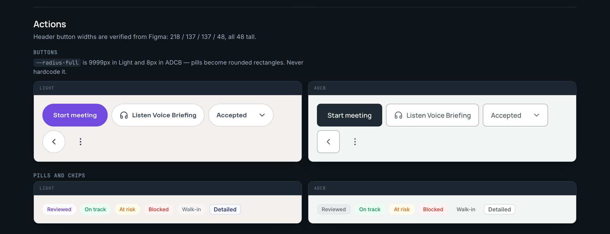
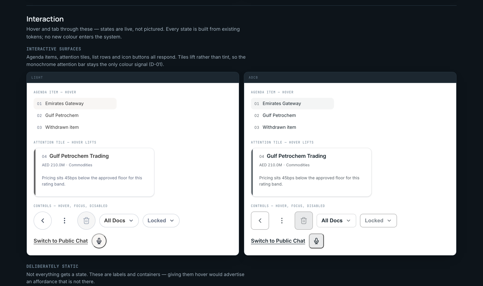
- radius-fullA full round in Light, 8px in ADCB. Every pill becomes a rectangle: buttons, chips, the mic, the back control.
- font-displayF37 Lineca in Light, Manrope in ADCB. Every heading changes typeface.
- font-textF37 Lineca in Light, Inter in ADCB. So does every line of body copy.
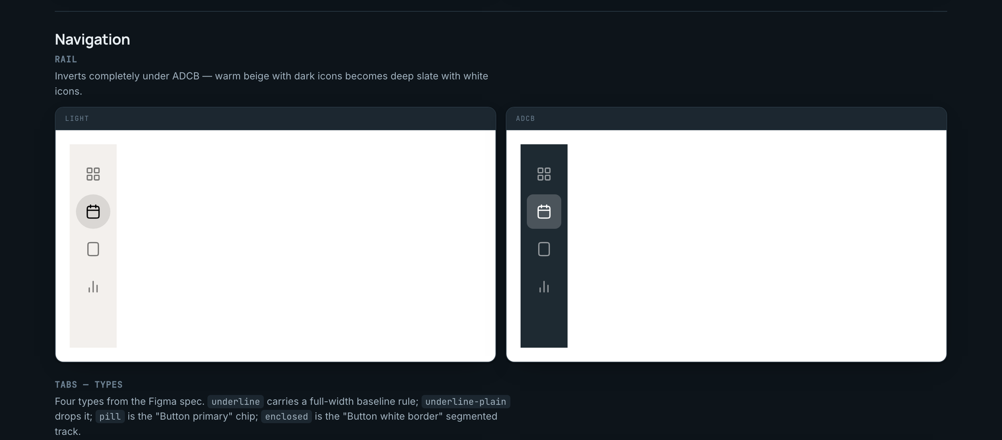
- bg-brand-solidPurple in Light, slate in ADCB. The brand colour is a near-black, so every assumption about an accent, that it stands out, that it reads as emphasis, that white text sits on it, has to be re-checked.
That finding set the architecture. A system that treats theming as swapping colours cannot say "this button is a pill in one brand and a rectangle in the other", and it cannot change a typeface at all.
The fix is one rule.
Three layers. Primitives hold the raw colour ramps and scales and no component ever touches them. Semantic tokens sit on top and are the only thing a component may read. A brand block overrides semantics and nothing else.
Components read semantic tokens only. No raw colour, no fixed corner size, no font name typed into a component. Ever.
Nobody keeps a rule like that by discipline alone, so I made it mechanical. A script reads every component and fails the build the moment it finds a raw value. The mistake is now impossible rather than merely detectable.
Five things the system was hiding.
The most useful output was not the code. It was a list of defects that only showed up once both brands had to render from one source. None came from the rebuild. All five were already live.
Found by measuring, not by looking
- The ADCB logo was invisibleA dark mark on the dark nav rail, both the same value. I sampled the rendered pixels rather than trusting the layer name.
- One colour was bound to nothingThe assistant's reply bubble followed a brand token in Light. In ADCB someone had typed a grey in by hand, so it stopped following the brand and would have broken silently on the next theme.
- The attention scale collided with the canvasADCB's darkest attention step is the same value as the app background. Put a marker on the canvas and the top of the scale disappears.
- Two tokens passed contrast in one brand and failed in the otherSecondary and meta text measured 4.6:1 and 5.0:1 in Light and 3.7:1 in ADCB, because the slate ramp is lower contrast than the purple it replaces.
- The theme silently did nothingA token whose value is another token resolves where it is declared, not where it is used. Declared on the root, it bakes in the Light value and the ADCB override does nothing. The CSS read perfectly. I only caught it by measuring computed styles in the browser and finding ADCB still painting purple.
I treated the contrast failures two ways, and the distinction mattered. A token that passes in one brand and fails in the other is a bug, so I fixed it outright with colours already in the client's ramp. Text that fails in both brands is inherited from the source design system. Changing it is a deviation from Figma, not a defect fix, so it sits behind an opt-in flag waiting for design sign-off. Fixing everything would have been easier and less correct.
Guards, and the one that lied.
Findings decay. Guards do not. Four scripts run before anything ships, and none of them is a checklist.
- token-lintFails the build on any raw colour, corner size or font name inside a component. The one rule, made unbreakable.
- contrast-auditMeasures every text-on-background pair in both brands, flattens transparent colours against their real backdrop first, and prints what fails.
- build-spriteRebuilds the icon set from Figma exports, so no icon is ever drawn by hand.
- bundlePacks a page into one file and refuses to publish if its script would throw. It also leaves the licensed typeface out rather than embedding it in every copy.
The contrast audit taught me something. I fixed the two ADCB regressions, re-ran it, and it still reported them. The script kept its own copy of the palette, and that copy went stale the moment the tokens changed.
A guard that can disagree with the thing it guards is worse than no guard.
Rewritten to read the generated token file directly, it went from 26 reported failures to 8 real ones. It had been wrong both ways at once: counting exempt borders and disabled text as defects, while missing that its own numbers were out of date.
How the team uses it now.
One core, and everything builds from it. Nothing gets drawn twice.
components
icons
the rules
A designer asks for a screen by name. An installed skill loads the tokens, the canonical markup, the icons and the rules, follows the product constraints, and returns the screen in both brands. That is the moment the library stopped being something the team reads and became something it uses.
Holding it together is one file, system.md. It tells a person or a model how to build here: the rule, how to switch brand, the shell measurements, what the product must never say, and what is still unfinished. It is also, word for word, the context we paste into Figma Make.
- Explore properlyFour or five versions of a feature, generated in both brands, so the choice is made by looking rather than imagining.
- Spend the time on polishAssembly is done by the time the work reaches a designer. What is left is judgement.
- Add something onceA new component or token lands in both brands at the same moment.
- Check contrast before the reviewOne script, both brands, while the work is still cheap to change.
- Stop shipping brand bugsAll five defects above had passed design review. The linter catches that whole class on its own.
- Add an icon without drawing itLook up the name, export the node, run the script.
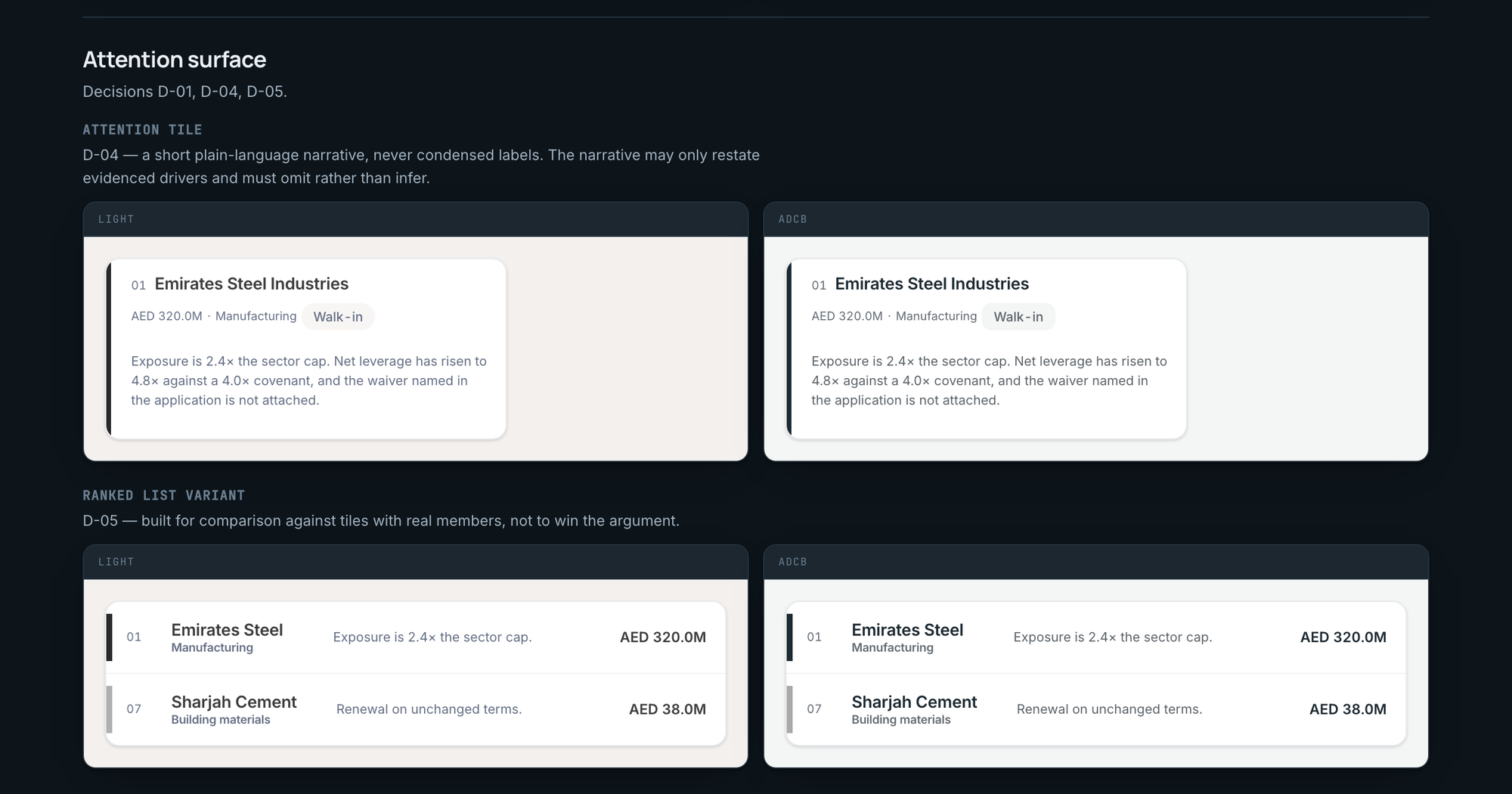
Worth being exact about the evidence. Four MCC committee views were generated rather than drawn early on: attention as tiles, attention as a list, the item drill-down, the in-meeting view. Four real answers to one question, side by side. That is what proved the approach was worth systematising. But they came before the token core existed and carry their own inline styles, so they are snapshots. The component gallery is the one surface running on the live system, and that is the real test: change a token and the gallery changes. The snapshots do not.
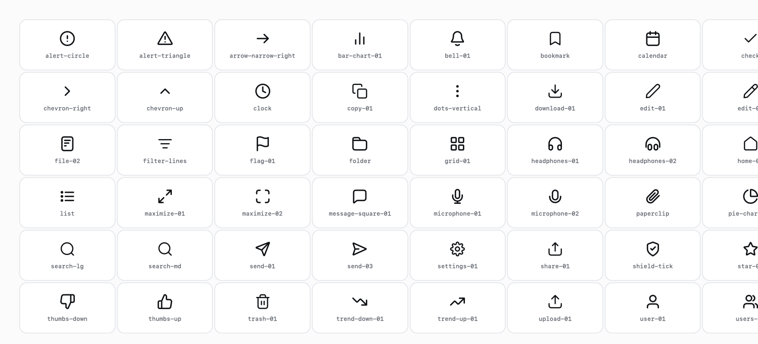
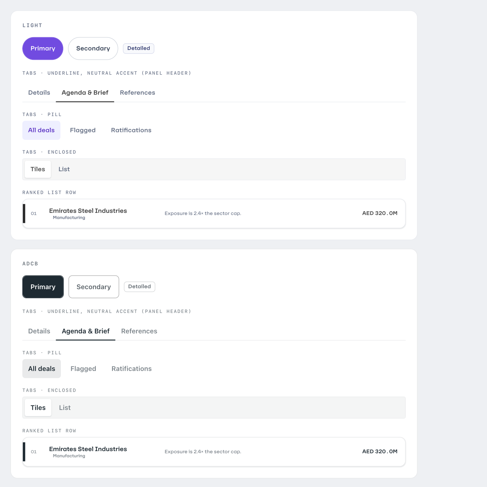
The gallery, section by section.
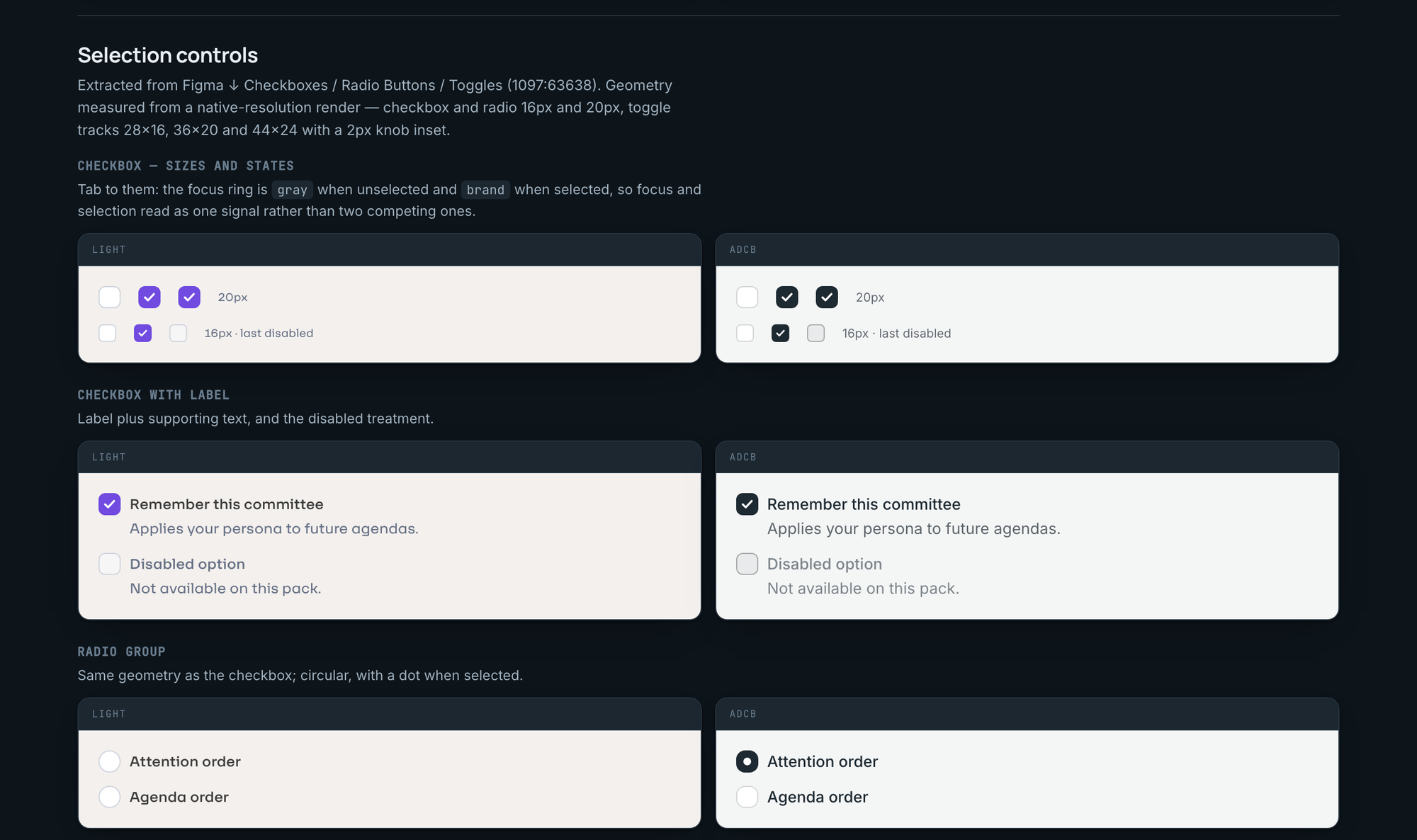
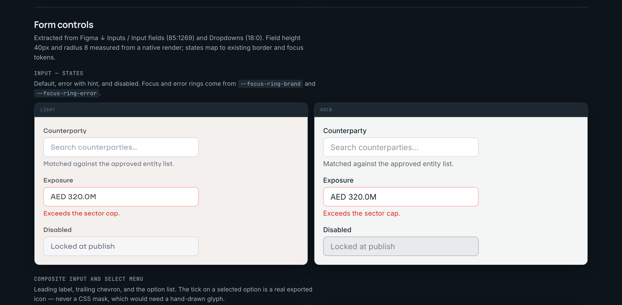
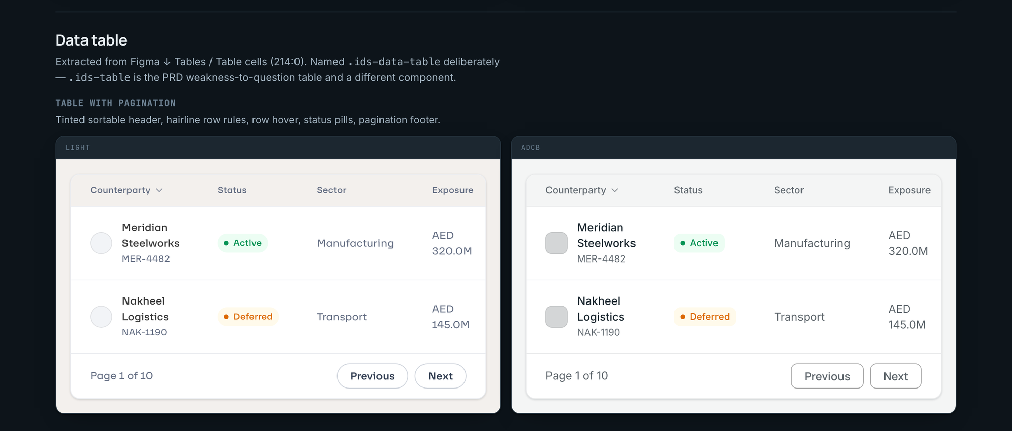
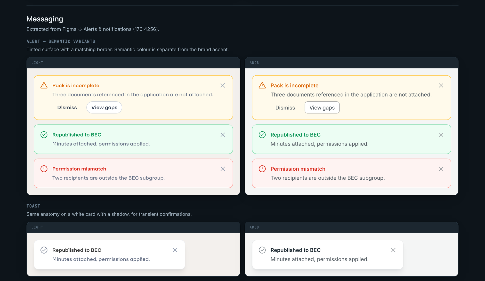
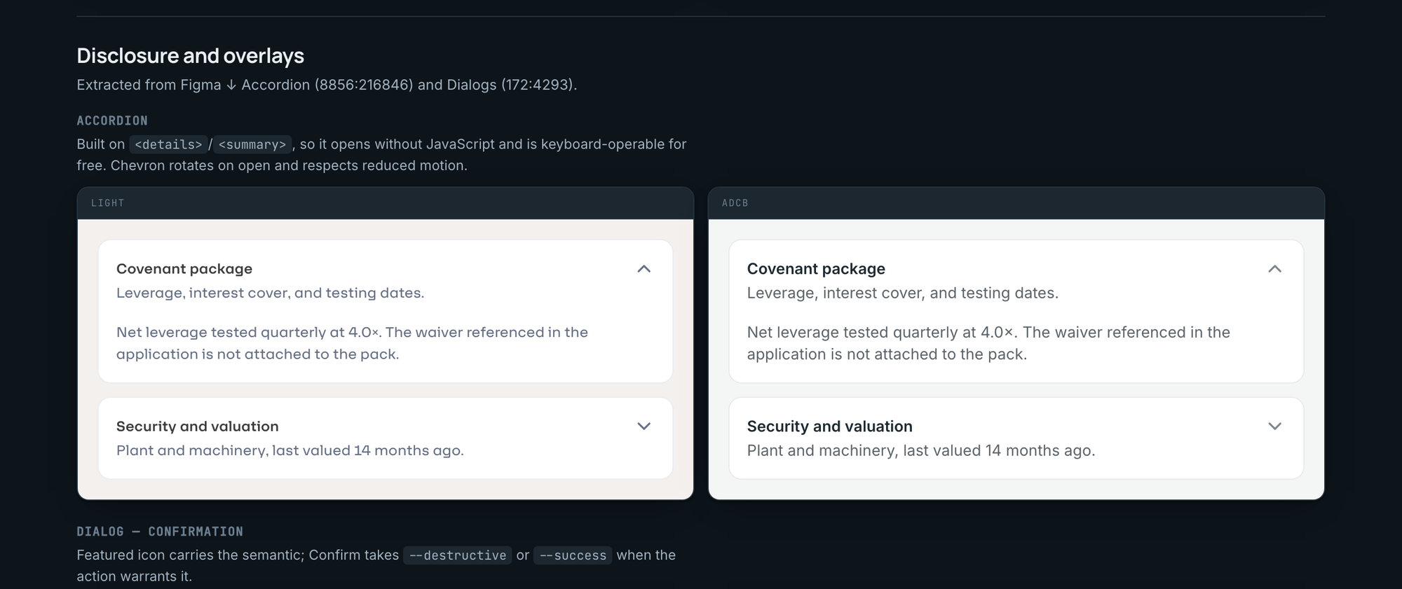
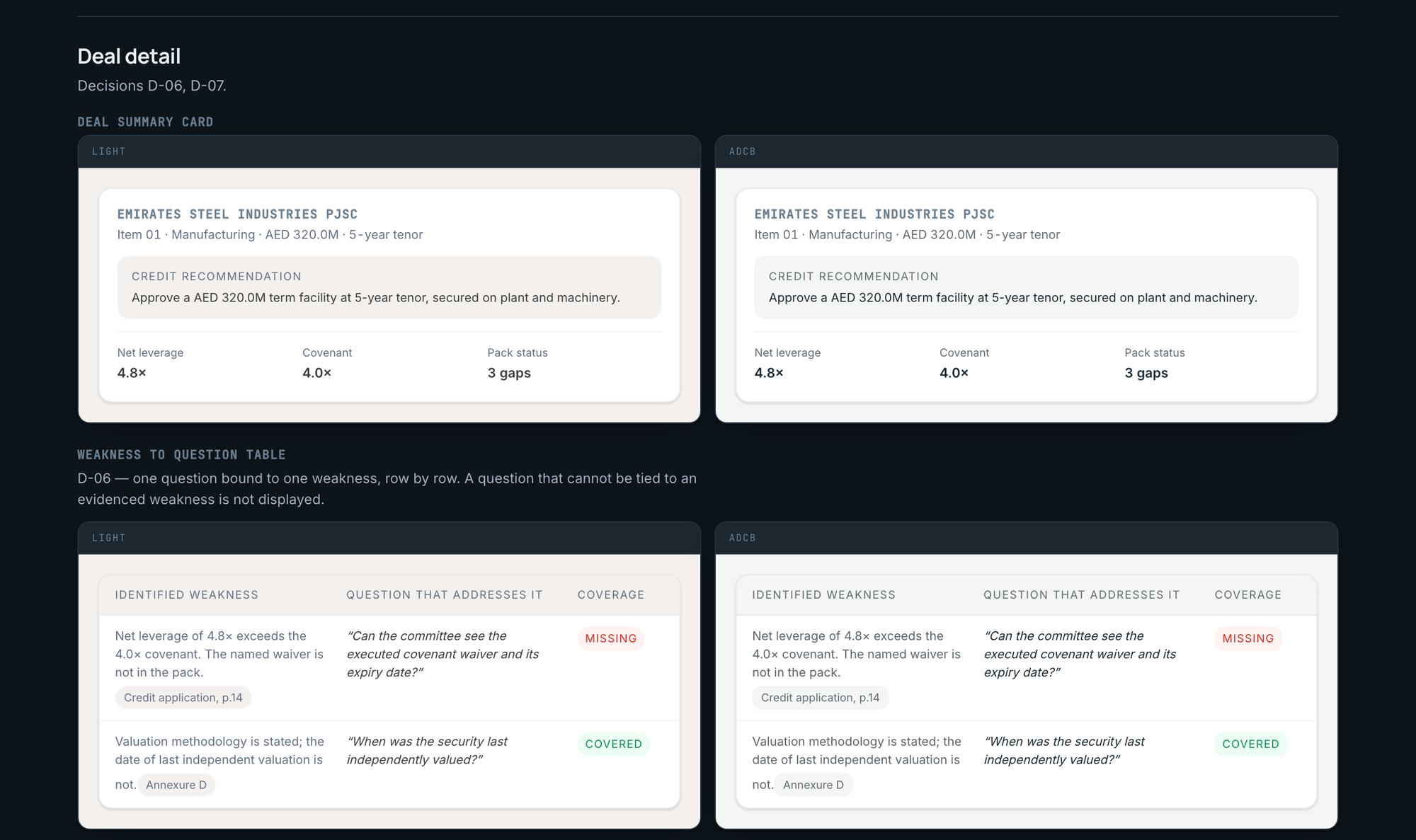
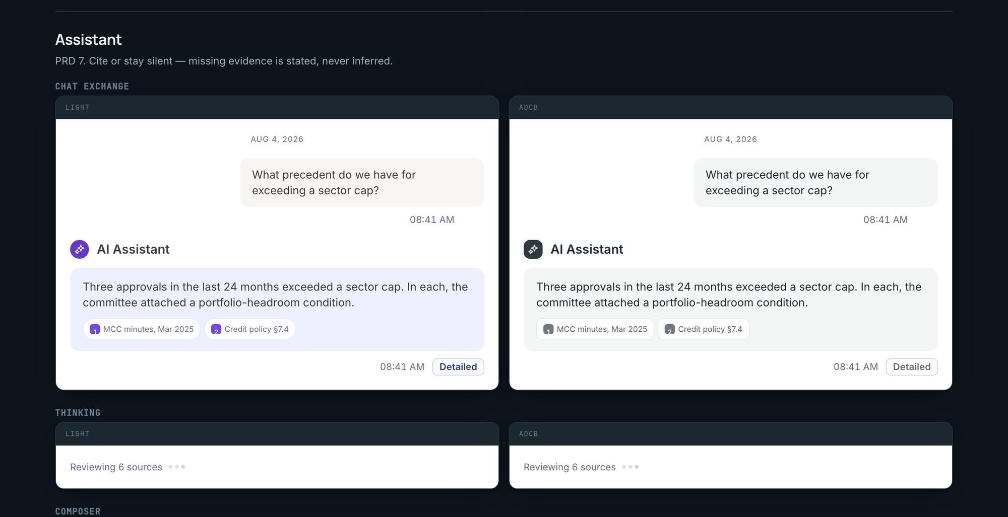
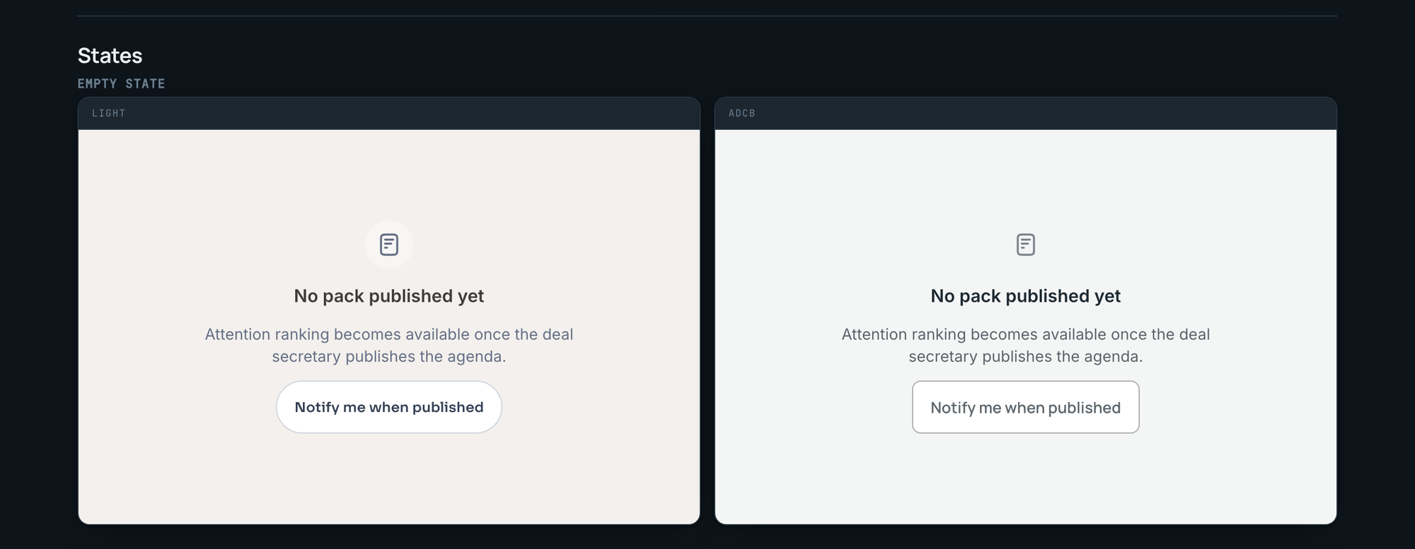
Every specimen below is the live system rendering both brands from one set of markup, captured today with the real typeface. Under each one: what the team used to do by hand, and what happens now.
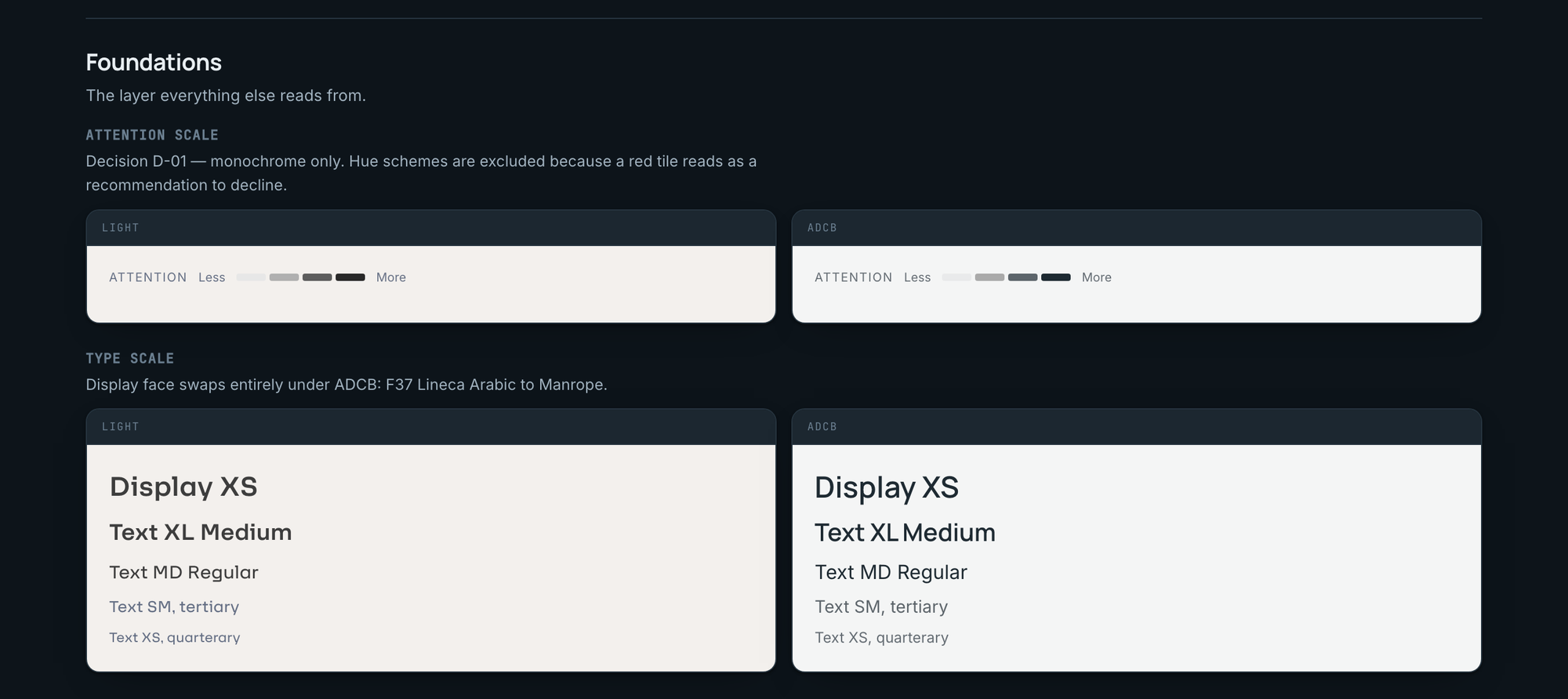
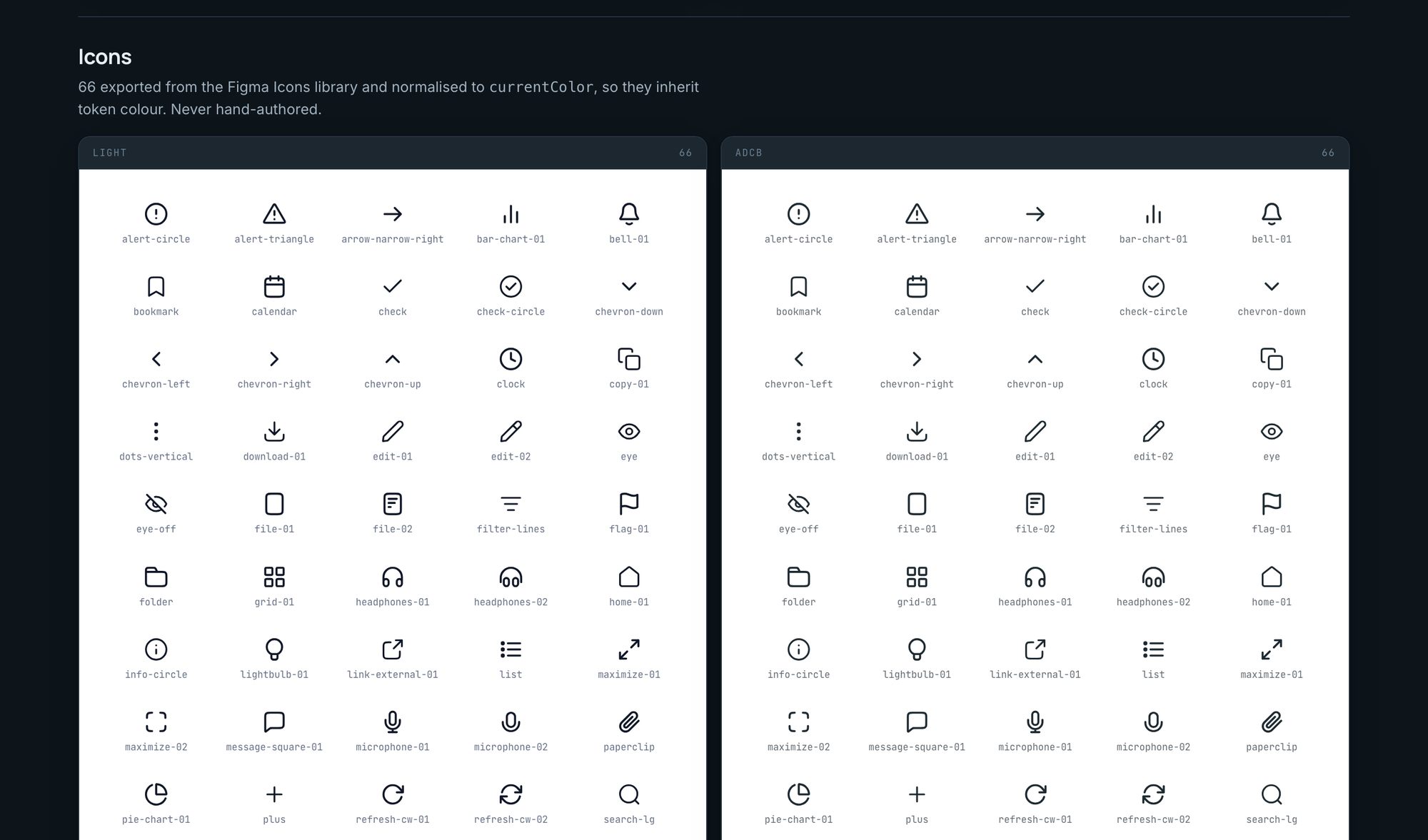
Where it stands.
The 41 is deliberate. Those tokens appear on no ADCB frame I could read, so they fall back to the Light value and say so, in the CSS and in the JSON. The gap closes with one screenshot of Foundation's variables panel from whoever holds that file. I would rather ship a system that says which part of itself is assumption than one that looks complete and quietly is not.
Still open, and named as such: the data table is partly built, the 41 inferred values need confirming, and a few primitives remain. The next call is not mine. Foundation gives us how a dialog should look; it cannot give us focus traps, keyboard navigation or the ARIA wiring underneath. The recommendation on the table is Radix for behaviour, our tokens for appearance, the shadcn pattern, and that decision sits with engineering.
01
The core
Tokens, components, icons, gallery, rules. Done.
02
Primitives
Checkbox, radio, toggle, input, select, tooltip, alert, toast built. Table and a few more open.
03
Close the gaps
Confirm the 41 values. Re-run the audit. Waiting on one screenshot.
04
Keep them in sync
Token export from Figma on a schedule. Tokens change in Figma first, never in code.
What I got wrong.
I asserted something false, repeatedly. I searched one of the three Figma files, found no form controls, and concluded the system had no primitive layer. I wrote that into the documentation, the tooling and the plan. A colleague pushed back. The primitives were all there, in a different file, and my own notes had contained the evidence the whole time. The failure was not the search. It was turning a finding about one file into a claim about the system, then never re-testing it once it became load-bearing.
I verified too late. Two bugs shipped into a published page, a script error that rendered it empty and a font stack that silently fell back, because linting and bundling both passed. Neither of them opens the page. Now nothing publishes without being loaded and measured.
I would tokenise shape earlier. Radius and typeface were treated as incidental until the comparison forced them into view. On the next multi-brand system they go into the first token pass, not the third.
And the 41 inferred values exist because I designed around a missing Figma permission for two weeks instead of asking for it on day one.